Happy Google I/O week, my fellow Android-appreciating animal! While we wait for El Googlenheim to drop all sorts of interesting new goodies on our suspiciously greasy domes, I've got a trio of important truths for you to chew over:
- One of the best parts about Android is how easy the operating system makes it to take total control of your experience and make your phone work any way you want.
- One of the best ways to harness that power is by taking advantage of a custom Android launcher — an app that replaces your standard home screen setup with a more efficient and customizable environment.
- And one of the best Android launchers out there just got an inspired new update that adds even more oomph into that opportunity.
It's my personal favorite Android launcher of the moment, in fact, and an app that's one of my top secrets to a more productivity-minded Android interface arrangement. And Goog almighty, lemme tell ya: This latest addition within its virtual walls will really send your efficiency soaring.
Best of all? You can get it up and running on any device this second — no new Android versions or fancy-schmancy Google-I/O-announced goodness required.
Let me show you how.
[Get Googley tips in your inbox every Friday with my Android Intelligence newsletter. Three time-saving tips as soon as you sign up!]
Your new Android widget wonders
First things first: The launcher itself is a lovely little ditty called Niagara Launcher.
If you've followed my musings for long, you've probably heard me wax poetic about it before. (It's a frequent topic of conversation and adulation in my Android Intelligence Platinum resource community, where it's also now become a built-in perk of membership.) I've fallen hard for the clever and unconventional approach Niagara brings to the Android home screen, and no matter how many times I toy around with other setups, I always seem to end up back in its loving embrace.
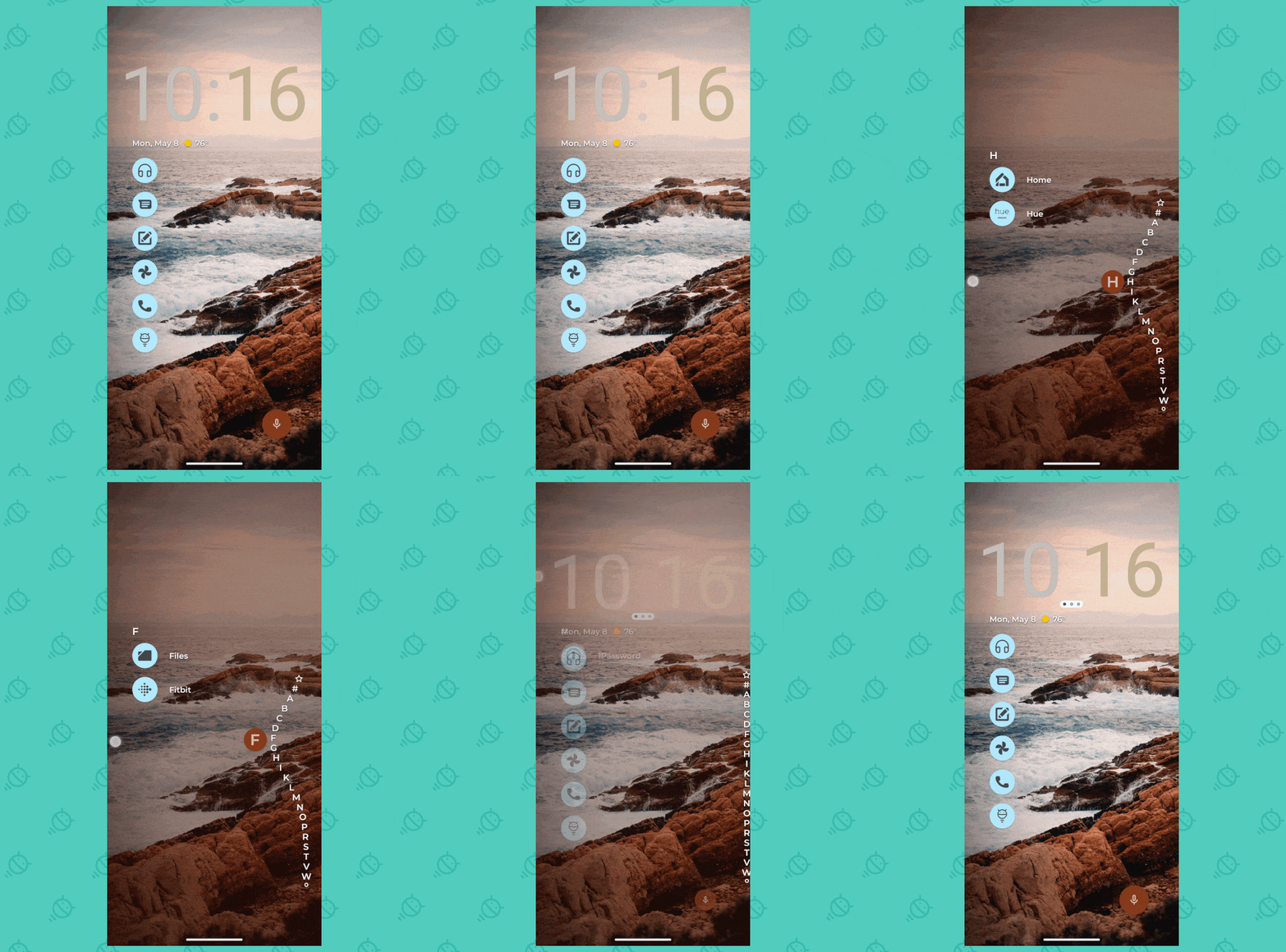
At its core, Niagara replaces the standard Android home screen environment with a simple list of your most commonly accessed apps. Everything else lives within a scrolling alphabetical menu that you pull up by swiping along either side of the screen.
 JR
JRThe launcher is all about simplicity, by design, and eliminating all the efficiency-harming clutter most home screens are weighed down by. To that end, the system supports just a single on-screen widget at its uppermost edge — part of its mission to encourage thoughtful configuration and keep only the stuff you actually interact with regularly front and center.
Now, though, Niagara is offering up a new way to put even more pertinent info at your fingertips — without abandoning its minimalist, focus-centric philosophy.
It's an option to stack multiple widgets on top of each other in that one single space, thus giving you on-demand access to more useful info while still maintaining the launcher's clutter-free environment.
See?
 JR
JRNow, if that seems familiar, it should: A similar sort of widget-stacking setup showed up across the mobile-tech divide on the iOS side a while ago. But easy as it may be to write something off as "an iPhone thing," remember: That kind of inspiration-borrowing isn't always a bad thing. Heck, Apple's very adoption of widgets in the first place was a blatant Android-copying move. But by bringing widgets to the iPhone-totin' masses, Apple indirectly forced Google to start treating widgets on Android as a priority again — after years of agonizing neglect. And that, in turn, has empowered developers to come up with stuff like this. At the end of the day, competition is a good thing for us all.
And that's very evident in the delight of using stacked widgets within Niagara Launcher, especially if you go about it in a deliberate way and really take the time to consider which specific widgets would most effectively enhance your efficiency in that arrangement.
For me — for the moment, at least — I've added two new widgets into my rotation to complement my color-changing, Material-You-enabled clock:
- First, with a single swipe to the left on the Niagara widget area, I can now see a list of my latest tasks from Todoist — a top-notch Android organizational app and one of the best task managers around. After years of sticking to a streamlined Google Calendar setup for all of my tasks and reminders, I've been playing around with using it to track certain types of personal and work tasks. And having those items a single swipe away makes it blissfully easy to check up on what random chores I need to be thinking about at any given moment.
- Second, with single swipe to the right on that area (or two swipes to the left; it's a circular rotation), I can now see the native Android 13 battery status widget. I've never really used that widget before, but I've found it's a handy way to quickly glance and see how much battery life is left on my phone itself as well as any other connected gadgets — both the precise percent and an estimate of my remaining real-world use time.
Getting started with the new Niagara Launcher widget stack setup couldn't be much simpler, either. Just download Niagara from the Play Store if you don't already have it, then open it up and follow the prompts to set it up and set it as your default system launcher. (If you ever want to change that, you can always just uninstall it — or search your system settings for the word "home" to find a switch.)
Once you're staring at your shiny new home screen setup, press and hold your finger onto the generic default clock at the top of the screen and select the "Add custom widget" option. (You can also flip the toggle next to "Show clock," if you want to turn that default clock off.) Select whatever widget you want, then follow the steps to add it onto your home screen.
All that's left is to press and hold your finger onto that freshly added widget and tap the "Add custom widget" option once more to create your swipeable stack. When you select a second widget, Niagara will ask if you want to create a stack. Tap the button to confirm, and boom: Your first official Android widget stack is alive and well, and all you've gotta do is swipe your finger horizontally on that area of the screen to explore it.
If you want to add another widget into the mix, follow those same steps again and select whichever widget your Android-adoring heart desires. I'd suggest two or three widgets as the optimal number, as that keeps everything no more than a single swipe away and avoids creating any counterproductive clutter.
Pretty nifty, wouldn't ya say? Niagara Launcher is free to use, too, though it does require a $10-a-year (or $30 lifetime) upgrade to its Pro version if you want to maintain access to the stackable widgets and other advanced options. If all that stuff enhances your efficiency as much as it does mine, it's pretty easy to justify that as money well spent.
And, notably, it doesn't require any manner of maddening waiting or I/O-announcement lusting at all.
Learn all sorts of off-the-beaten-path Android time-savers with my Android Intelligence newsletter. Three new things to try every Friday!


