Launchers are one of Android's most powerful and unusual features — and yet, they're also one of the platform's least understood elements.
Ask an average Android phone owner what launcher they're using, and odds are, you'll get little more than a quizzical look (and maybe a swift kick to the shin) in return. Ask a power user about their launcher preferences, though, and you're likely to launch yourself into a 45-minute conversation about the merits of all the latest options.
Me? I've always fallen into that latter camp (which comes as a huge surprise, I'm sure). I've loved the presence of Android launchers since way back in the days of Froyo — a dated and nerdy enough reference at this point that if you understand it, you're probably a fan of Android launchers, too. And in case you aren't familiar with Android launchers yet, they're specialty apps that replace your entire home screen and app drawer environment with something different — something that's typically more customizable and often less cluttered than your phone's default setup.
To me, launchers have long represented the unique sort of power, flexibility, and personalization Android provides — something you certainly can't find on that other smartphone operating system. And while they're often written off as an unnecessary tinkering-geek indulgence, I think they have the potential to be not only useful but also downright transformative for any phone-owning person and/or ostrich, no matter their geek quotient (or beak quotient).
The reason is that launchers are able to do so much more than just change the mere appearance of your home screen or any other such superficial thing. A thoughtful Android launcher can completely change the way you use your phone and interact with information within it. It can improve your efficiency and cut down on distractions. And it can make even an aging cellular telephone apparatus feel new, exciting, and full of fresh features — features that you wouldn't even find on any out-of-the-box hardware you could go out and buy today.
And that brings us to this present moment — and the reason I'm writing this column. The purpose of this article isn't simply to wax poetic about the joys of Android launchers and the advantages they offer (much as I do enjoy dancing atop that soapbox). Nope: It's to talk about why I'm suddenly finding myself excited about Android launchers and freshly optimistic about their future for the first time in a long time.
Like I said, I've always loved Android launchers and everything they represent — and I've used 'em since I was just a tiny phone-totin' tike in a pair of old-timey pantaloons. But lately, I've found myself feeling a little frustrated by the state of the Android launcher lineup.
Now, don't get me wrong: There's no shortage of excellent and actively maintained launchers in the Google Play Store. We've got some incredible developers 'round these parts, and they do some spectacular work.
But for a while now, the Android launcher selection has been feeling a little...stale. There are plenty of polished and professional options, without a doubt, but most of the higher-profile titles have started to feel like modestly different twists on the same basic concept — the "blank-canvas grid with all of Google's features and oodles of extra options" idea mastered by the classic (and still every bit as exceptional as ever) Nova Launcher.
I've lost count of the number of launchers that take that same basic concept and present it in a slightly different way. I mean, look: They're all perfectly fine. Some of them are even quite good! But they're all essentially just different twists on the same core concept. There's little that's distinctive and certainly not much that's exciting in that field.
Personally, what I find the most interesting about Android launchers is when they manage to come up with something that's creative and original — something that brings a genuinely new perspective into the Android home screen arena. And after what's felt like an eternity of fine but mostly uninspired sameness, we're finally starting to see some truly cool stuff.
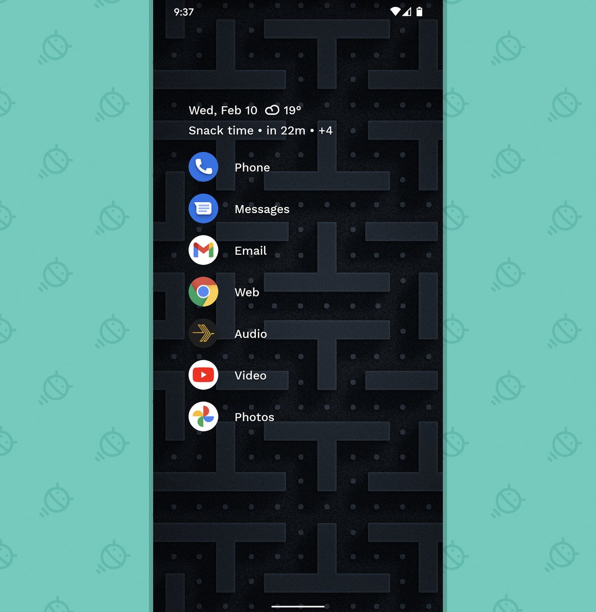
Take, for instance, the newly-out-of-beta Niagara Launcher. I've been covering and keeping a close eye on Niagara since its earliest development days, back in 2018, and I've always been impressed with the innovative way that it rethinks how an Android home screen should operate. Niagara ditches the traditional grid for a carefully structured collection of shortcuts for your most commonly used apps. It's an opinionated, distinctive stance, and it makes for a bold, minimalist, and remarkably effective hub for getting to the stuff you open the most without having to wade through all the usual distractions.
 JR
JR In Niagara's home screen vision, all of your other apps — the ones that aren't in that main spot on the single home screen panel — exist in a letter-based list that you scroll through by moving your finger up and down along either edge of your phone's screen. That easy-to-use, step-saving interface is exactly what led to my "ergonomic efficiency" description of the app (a phrase that the app itself has since adopted as part of its own Play Store description — insert humble bow here) in my earlier assessment.
 JR
JR With its recent beta-exiting launch, though, Niagara has added so much more into that already-impressive framework. The launcher now includes its own cleverly designed calendar and weather widget, for instance — and tapping that area of the screen pulls up an elegant panel with more detailed agenda and forecast info. I honestly think it's nicer and more carefully considered than most of the standalone agenda widgets that are out there.
 JR
JR Niagara has lots of other thoughtful touches, but it isn't the only recent Android launcher advancement that's restoring my excitement in the area. One of my old favorites, Action Launcher, is also getting some much-needed new love right now. Action Launcher used to epitomize the very sort of original, creative, and innovative approach we've been talking about with Android launchers — but then, well, things seemed to slow down. The app didn't even receive a single update for well over six months, and the updates it received before that lull weren't exactly mind-blowing.
But then, right as I was marveling over Niagara's advancements, bam: Action Launcher's developer announced an upcoming update that makes any regular Android widgets within the launcher stackable — just like Apple offers with its initial iOS widget implementation. That's something new. That's something useful. That's something that pushes the platform forward and offers up an efficiency-enhancing option no one else within Android provides. That's what we've been missing!
 JR
JR The feature is currently available only in the app's beta channel, and it's a little rough around the edges — as you'd expect for an under-development element — but still, it's promising. And it's the exact sort of sign of life and inspiration that's been lacking in this area for far too long now.
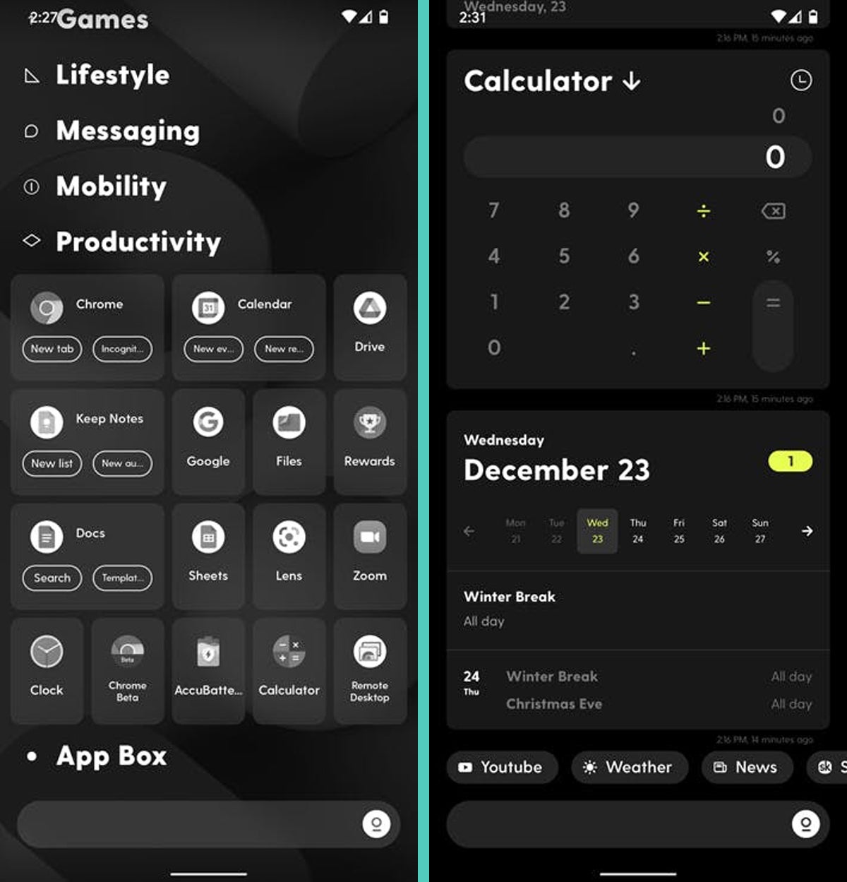
Another such sign of life comes from an under-development launcher called Ratio. Ratio has to be one of the weirdest Android home screen experiences I've ever seen, with a category-driven tile-based view that automatically organizes your apps on its main panel, a series of native widget-like views of information from within apps on another panel, and an ambitious system that aims to create the exact sort of streamlined messaging hub I'm still hoping we'll see as part of Android itself one day on the other side. Forget about those uncertain hopes and dreams; Ratio is actively working to achieve it this very minute.
 JR
JR Now, look: All of these concepts may not appeal to you. They certainly aren't all right for me. But that's not the point. The point is that Android's launcher developers are experimenting again. They're trying new concepts and aiming to bring something different into the phone-using experience. They're working to rethink what you actually need on a home screen and what the best way might be to present and organize your information. And exploring their concepts — even the still-under-development ones — forces you to rethink everything you think you know about how a phone should work.
That's how progress happens — both on a broader technological level and in terms of our own never-ending quests for individual mobile-tech optimization. And for the first time in a long time, my goodness, it feels like we're finished treading water and ready to start thinking creatively again.
Sign up for my weekly newsletter to get more practical tips, personal recommendations, and plain-English perspective on the news that matters.


