Let's just get this out of the way right off the bat: Yes, Google copied Apple when it comes to its new Android Q gestures.
There's no way around it, really: The idea of having a thin bar at the bottom of a phone's screen that you swipe up on to go home or swipe up and hold to look through your recently used apps is a pretty distinctive element of Apple's current iOS interface.
Now let's get something else out of the way: This bit of "great idea stealing," to, ahem, borrow a certain phrase from a certain someone, shouldn't be a major cause for concern among us mere mortals who use these mobile tech products. And, critically, it shouldn't be viewed as a unique or uncommon phenomenon — or anything that even comes close to being a one-directional behavior.
In fact, when uttering that now-famous incantation — "Good artists copy, great artists steal, and we have always been shameless about stealing great ideas" — late Apple founder Steve Jobs was ultimately defending the way his company openly borrowed ideas from Xerox in order to create the first Mac. Sure, Apple's team arguably built upon the concepts Xerox was working on and used them as part of a broader and at least partially original concept, but the element of unabashed idea-borrowing is an undeniable part of Apple's history.
"I think people focus on the Picasso statement and focus on the word 'steal,'" Apple software vice president Bud Tribble told CNET in 2014. "If you take that word ... and replace it with 'make it your own,' I think the underlying idea is that you can't do great design by copying something because you aren't going to care about it. If you take something and make it your own, what really happens is now you care about that design. It's your design, and that is the dividing line between copying and stealing."
That, many tech philosophers have argued, is what actually happened when Steve Jobs blatantly borrowed interface concepts and peripheral ideas from Xerox and implemented them into the original Mac. That same thing, one could similarly say, is what's happening with gestures on Android and iOS right now. And that same thing has most certainly happened plenty of times between the two platforms, in both directions, before.
With gestures, the thin bottom-of-screen bar and its most basic commands are clearly being framed as an emerging standard of sorts. But as anyone who's used both operating systems knows, Android's overall take on the concept isn't, in fact, identical to iOS's. Apple-favored commands like swiping down from the center of the screen to search or swiping down from the upper-right corner of the screen to open a control center aren't present on Android, for one.
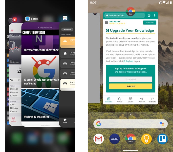
Beyond that, the gesture-accessed app-switching interface takes on a distinctively Android-like appearance in Google's implementation — one that's been around for a while now, with contextual app suggestions and a universal search bar built into that very same area. And the (still-problematic) system-wide edge-of-screen Back gestures are Android through and through.
 IDG
IDG
The app-switching interface in iOS, left, and Android, right
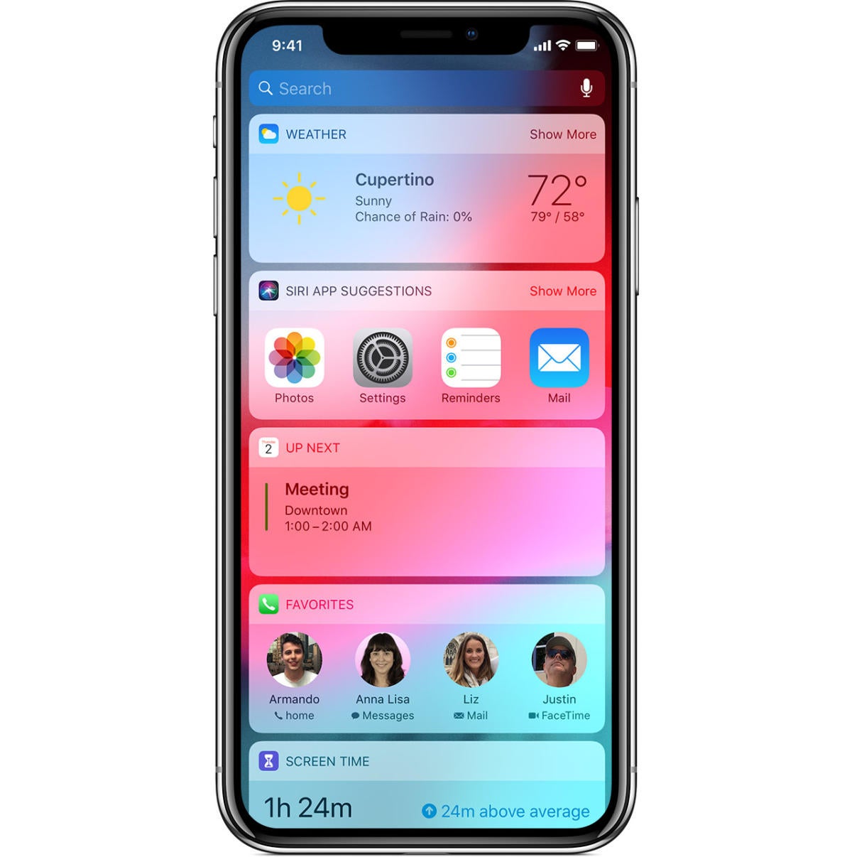
At the same time (and lost in much of the discussion surrounding this subject), some elements of Apple's iOS system are pretty plainly inspired by Android. Having a card-based, app-driven info feed one swipe to the right from the home screen, for instance — what Apple calls the Today View — is a rather overt bit of idea-borrowing from Google's Google Now/Google feed concept. Being able to swipe down from the top of the screen to access and manage notifications is another trademark Android element — one that iOS didn't gain until 2011.
 Apple
Apple
Apple's iOS Today View interface — something seems strangely familiar...
For years, in fact, the almost-cliched response to an iOS event was: "Oh, great, Apple 'invented' some more Android features." It's even become a running joke on Twitter: "How long will it take for the flood of tweets about 'Android had it first' to appear?"
And for years, there's been no shortage of examples — ranging from the support of widgets and hotword-based voice activation to raise to wake, tap to wake, app-to-app sharing, swiping-based typing, travel time and location-based reminders, and even the initial shift from physical buttons to on-screen navigation (not to mention the move to larger phones — something Jobs famously decried and Apple long resisted). The list goes on and on and continues still today.
But lest we get too deep into the example-digging trenches, let's make one thing clear: The point of all of this isn't to play a game of "who did it better" or "who did it more." Rather, it's simply to say that to a certain degree, idea borrowing is an inevitable part of tech evolution. When one platform has a good idea, it's bound to show up on others before long. That's how standards come to exist — and then let you intuitively know how to get around any new product you're using — and it's something that only stands to benefit us all as users of these devices.
Ironically, on the Android side of things, the elements most directly copied from Apple tend to be among the weakest parts of the picture — because some of the time, a concept that works in one piece of software doesn't make sense in another. That's absolutely the case with the iOS-like implementation of App Shortcuts on Android, where I've remarked that "instead of thinking through what'd be the most sensible and user-friendly way for a feature like this to work, Google seemed to just emulate the way Apple did it":
What we have now is a promising but rough-around-the-edges start that's limited mostly by its inspiration. If we're lucky, Google will shift its take on App Shortcuts away from the Apple model and into its own original vision — one that's more sensible, user-friendly, and well-suited to its platform.
Similarly, with the new Android Q gestures, the iOS-like gesture for opening Android's Overview interface is awkward and inconsistent to use in Google's environment. It takes what was previously an integral, distinguishing, and easily accessible part of the operating system and buries it in an out-of-the-way place. Sometimes, taking too much inspiration from another source without thinking about why that concept exists and how it does or doesn't make sense in a different scenario can be a liability.
At the end of the day, though, feeling a sense of indignation over the notion that one company copied another is a misguided positioning of corporations as pride-demanding teams to which we all belong. Apple and Google aren't teams; they're companies. And we most certainly aren't cheerleaders or defenders of them; we're consumers who pay to use the associated products.
And you know what? Every bit of this evolution — including the hyperbole-filled silliness that tends to surround it — only works to make products progress and eventually improve on both ends of the spectrum. It makes every company involved work harder to stay ahead.
And that means, no matter which platform or type of product any one of us prefers, we all ultimately win by getting better gadgets in the end. Even if they invariably involve some amount of shameless copying along the way.
Sign up for my weekly newsletter to get more practical tips, personal recommendations, and plain-English perspective on the news that matters.

[Android Intelligence videos at Computerworld]


