Everyone knows Microsoft Excel as a number cruncher, but there’s a whole lot more to the popular spreadsheet program. Just as Excel can perform basic data analysis functions, it has a surprising number of data visualization tools under the hood.
“Excel isn’t explicitly a data visualization tool, it’s a spreadsheet,” says Excel developer and consultant Jon Peltier. However, one of Excel’s strengths is its flexibility, he adds. “It’s kind of a Swiss Army knife of software. In addition to formulas, Excel has structures in the worksheet that give it additional functionality for preparing data for analysis in data visualization.”
Read on for a guide to using Excel’s dataviz tools to present your data. We use the Office 365 version of Excel for Windows in the descriptions below; some features may not be available if you use a different version.
Charts
The most obvious data visualization option in Excel is its array of charts. Over the years, Microsoft has added more and more chart types to Excel, from basics like bar, line, and pie charts to more advanced styles like scatter and surface charts. Excel 2016 for Windows saw the addition of six new chart types including treemap, sunburst and waterfall, while Excel 2019 added funnel and map charts. (All the new chart types are available to Office 365 subscribers.) See “Excel 2016 and 2019 cheat sheet” for details about the new chart types.
 Microsoft
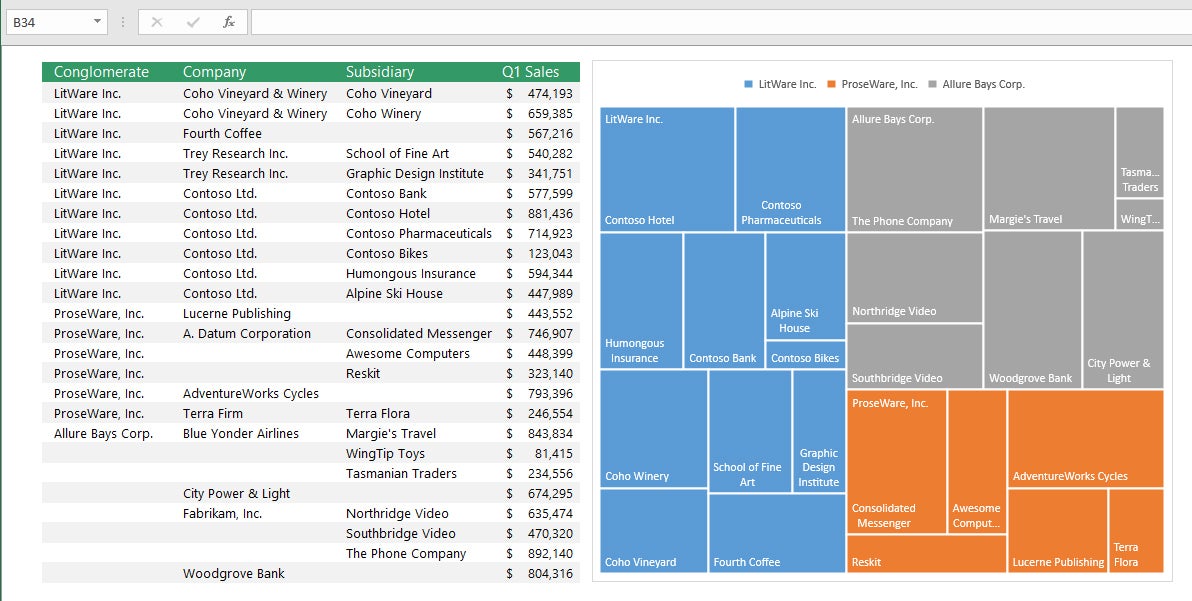
A treemap chart shows categories and subcategories of data as different-sized blocks. (Click image to enlarge it.)
To add any kind of chart to a worksheet, select the data you want to chart, click the Insert tab in the Ribbon and click the Recommended Charts button. The Recommended Charts feature looks at your data and suggests a few chart types that will display that data in most impactful way. If none of its suggestions suits you, click the All Charts tab and choose the type you want. To add a trendline to the chart, click Design > Add Chart Element > Trendlines and choose a trendline style.
PivotTables and PivotCharts
A basic Excel feature from which many other visualizations derive is the PivotTable. Doing proper data visualization in Excel starts with knowing how to use PivotTables and understanding how they work, says Peltier.
PivotTables provide a summary of your data, whereby thousands of rows and dozens of columns can be packaged into an easily readable form so you can highlight information and spot trends. They also let you group your data together in different ways so you can draw conclusions more easily, such as how the bottom line for a stat would look without a certain source.
PivotTables are particularly useful if you have long rows or columns of values. Excel has a basic summarization feature, the SUM (=Sum) function, which is great if you want to total up a dozen rows and a few columns. But what if you have hundreds of rows and many columns? PivotTables are like an amped-up SUM function.
The "pivot" part of a PivotTable is the ability to rotate (or pivot) the data in the table in order to view it from a different perspective. Again, this reflects greater data manipulation than the SUM function. For example, if you wanted to look at annual sales but exclude a month or quarter, you can do it with a click or two in a PivotTable. SUM requires more manipulation.
 IDG
IDG
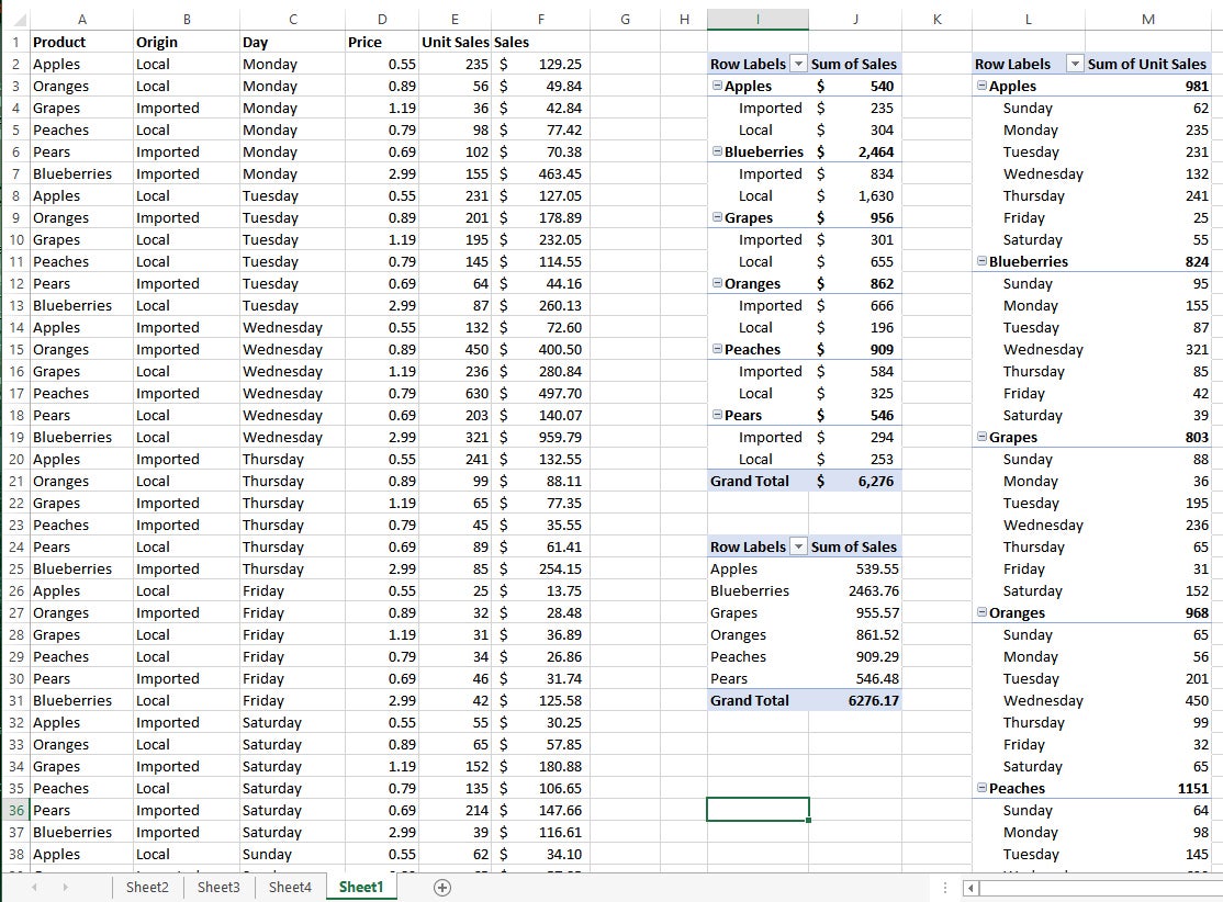
Three PivotTables on the right sum up the raw data on the left. (Click image to enlarge it.)
In the image above, you see the original data on the left, with columns for Product, Origin, Day sold, Price, Unit Sales, and Dollar Sales. There are three PivotTables next to the columns comparing sales of each fruit from imported vs. local sources, total sales for each type of fruit, and how each fruit sold by day of the week. This type of insight is simply impossible with the SUM function.
It’s easy enough to create a PivotTable. Select the rows and columns, with the label at the top of each column, from your data set. Click the Ribbon’s Insert tab, and the first two options are PivotTable and Recommended PivotTables.
With Recommended PivotTables, Excel looks at the contents of the sheet and presents you with a list of thumbnails for various PivotTables generated from all of the categories in your spreadsheet. Select the PivotTable you want and click OK.
The alternative way requires a few more clicks but lets you build a table using your own criteria, in case the manner you’d like to sort the data isn’t among the Recommended options. Click the PivotTable button and you will be asked to select the data range, the rows and columns to be included in the table. Click and drag to cover the range you want and click OK.
Whichever method you use to create the table, Excel will open a new worksheet with the table in it. If you like, you can copy it into the original data sheet as I did in the screenshot. Once you select OK, the PivotTable Fields pane will open on the right side of the screen; here you can select the fields by which to filter your data. If you chose a Recommended PivotTable, you can tweak it by checking and unchecking the fields in the PivotTable Fields pane.
PivotTables have the side benefit of finding sloppiness in your spreadsheets. For example, I do all my personal accounting in Excel, income and expense. In generating a PivotTable for 2018 I saw I had my estimated federal taxes entered as both “Fed” and “Feds,” while deposits were listed either under the publication name or “Deposit.” This forced me to go back and clean up the entries for a more accurate view in the table.
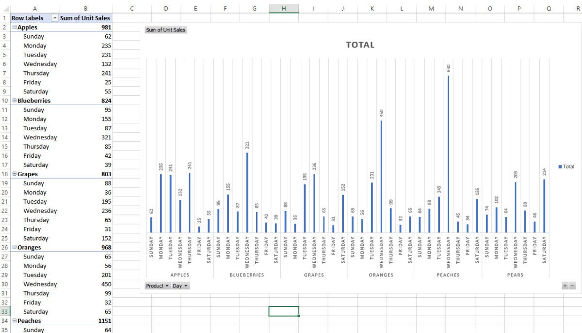
PivotCharts are visual representations of PivotTables. To insert a PivotChart, go to the Ribbon’s Insert tab and select PivotChart. It will ask you to select the data source range, just like a PivotTable, and pick the fields to chart.
 IDG
IDG
PivotCharts let you visually represent the data from a PivotTable. (Click image to enlarge it.)
Slicers
Excel lets you apply filters to PivotTables to focus on a smaller portion of their data. Slicers are canned filters that slice up data by categories, letting you quickly turn on and off categories to drill down into specific information.
Slicers are inserted from an existing PivotTable, so you must make the table first. From there, go to the Insert tab and click the Slicer button. Using our fruit sales spreadsheet, you can create slicers for specificity on day, location, or unit sales. In this example, we select Product, Origin, and Day.
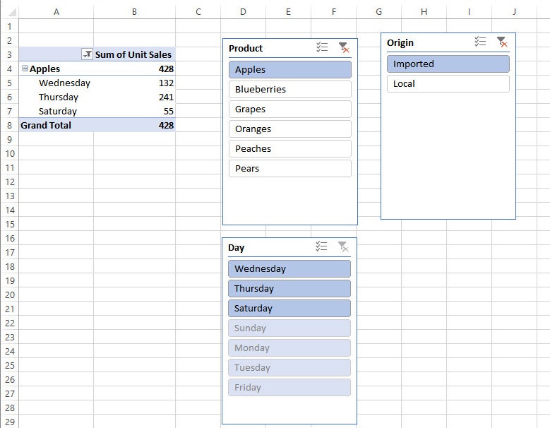
From there, three boxes pop up for each category. Under Product, select Apples, under Origin select Imported, and leave Day alone. Now we know the total number of imported apples sold that week and on which days. (In the example below, the days shown are automatically generated from the data. Imported apples were sold only on Wednesdays, Thursdays and Saturdays, so the slicer lists those days.)
 IDG
IDG
Slicers let you quickly filter data by category, such as the product, place of origin, and day sold. (Click image to enlarge it.)
Unlike filters, slicers can work across multiple PivotTables. And that is where Slicers work best, on multiple PivotTables. For a single PivotTable, a slicer is not really different from a filter.
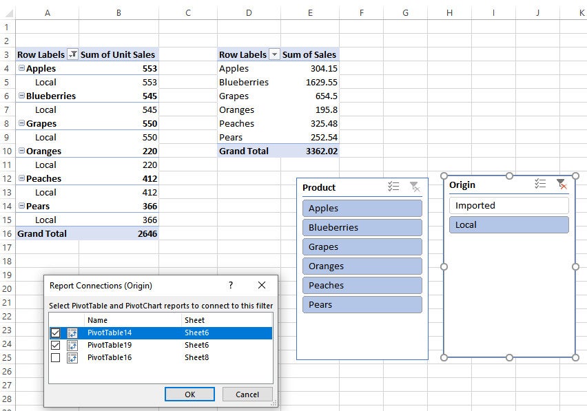
You connect two or more PivotTables by first creating them, then right-clicking on any of them and selecting Report Connections. This pops up a box with the connected tables. Initially, only one will be checked, the first one you made. By checking the others, you build the connection.
So again using our fruit spreadsheet, by connecting two PivotTables I can report on product and origin, and thus get a lump sum unit sales figure for locally grown fruit.
 IDG
IDG
Build slicer connections between PivotTables for even more specificity. (Click image to enlarge it.)
Sparklines
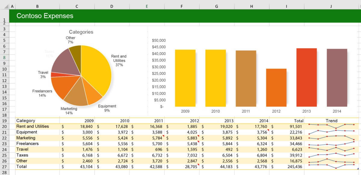
A sparkline is a tiny basic chart that appears within a single Excel cell. You can make a line, column, or win/loss sparkline within the cell and use it to highlight trends in your data.
For example, “you might have a dashboard showing how five divisions of your company have done every quarter over the last two years,” says Peltier. If you want a visual representation of how each division has performed, he adds, “you won’t have room on the screen for five regular charts. That type of information is nicely suited to sparklines.”
 Microsoft
Sparklines are mini-charts contained in single cells that highlight data trends, as shown at lower right. (Click image to enlarge it.)
You can create a sparkline from data in a table or a PivotTable. Select the data range, such as sales for a 12-month period, then go to the Insert tab on the Ribbon and select Line, Column or Win/Loss from the Sparklines section. Confirm the source data range, choose a destination cell for the sparkline, and click OK.
Remember that a sparkline goes in a single cell, so you’ll want to select data for it from a single row or a single column. That said, you can add multiple sparklines simultaneously by choosing a data range from multiple rows or columns, and choosing the corresponding number of destination cells for the sparklines. In other words, if you want three sparklines to show trends for three rows of data, select three destination cells.
Conditional formatting
Scanning over rows and columns of numbers in a spreadsheet can make your eyes glaze over. To make it easier to spot important data points and trends, you can use Excel’s conditional formatting feature to a table, PivotTable, or range of cells. For instance, you can tell Excel to make high values green and low values red; it will automatically lighten or darken the red and green color depending on how severe the high or low.
 IDG
IDG
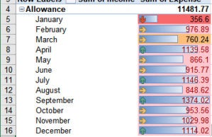
Three types of conditional formatting in a single cell: color, bar, and arrow. (Click image to enlarge it.)
Conditional formatting can also be used to highlight profit and loss, giving a good visualization of profit and loss over time, among regions, for different products, and so on. In addition to changing cells’ colors, you can use data bars or a set of icons.
To add conditional formatting, select the data you want to format, select the Home tab on the Ribbon and click the Conditional Formatting button in the Styles group. There you can choose which cells to highlight (e.g., greater than or less than a value, or the top or bottom 10%) and/or apply data bars, color scales or icon sets to the whole selection. The best part is you can add multiple formats. I added a light-to-dark color scale, arrows to indicate an increase or decrease from the previous month, and bars comparing the data in the cells to the single largest monthly entry.
Icons
An ancillary feature to conditional formatting and sparklines is adding tiny graphics to a spreadsheet using the Webdings font. “You can’t link to formulas but you can add pizzazz to a workbook by inserting a static picture to describe what your data is,” says Ken Puls, who runs the Excelguru Blog. This helps you summarize information so a manager can get in, see the overall trend and get out, Puls says.
The embedded icons can demonstrate things like upward and downward trends, profit and loss, or status level. To add an icon to a worksheet, go to the Insert tab on the Ribbon, select Icons in the Illustrations group, choose an icon and click Insert. The image appears on your worksheet, with “handles” so you can easily resize, rotate or move it.
Linked data types
Microsoft has recently rolled out an Excel feature it calls linked data types to Office 365 subscribers. Instead of simply numbers or strings, cells can now hold values that linked to an online data source — in this case, Microsoft’s Bing search engine.
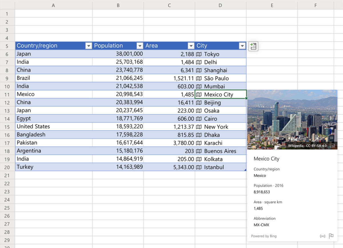
Right now there are only two data types: stocks and geography. Excel recognizes a stock ticker symbol or state name in a cell and pulls in relevant data from Bing in real time. Cells with one of these data types include an icon indicating their status, and clicking on the icon brings up a card with relevant information.
A stock cell, for instance, can show all kinds of information about the company and its stock performance, such as current price, 52-week high and low, P/E, and more. And a geography cell can show anything from a location's population to its power consumption.
 Microsoft
Click a linked geography cell to see all sorts of information about that location. (Click image to enlarge it.)
Adding stock cells is quite simple. Enter in a bunch of stock tickers or company names in a single column, then highlight them and click on the Data tab in the Ribbon. In the middle of the Ribbon you’ll see a Data Types group with buttons for Stocks and Geography.
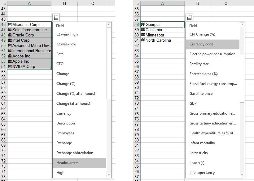
Click Stocks, and your tickers will be replaced with the names of the companies and an icon to the left of each name. Selecting a company will pop up a menu where you can select the types of data you want the company’s card to show.
Geography is also interesting. As with stocks, you enter a bunch of locations — states, countries, cities, etc. — in a single column, select the cells and click Data > Geography. You need to be precise, though. Entering GA, CA, MN and NC and then clicking the Geography button did not yield Georgia, California, Minnesota, and North Carolina for me, but Gabon, Canada, Mongolia, and New Caledonia. Geo, Calif, Minn, and N.C. did the trick. The full state names also work.
 IDG
IDG
Office 365 subscribers can perform a variety of stock and location comparisons and analysis in Excel. (Click image to enlarge it.)
The array of information about locations that Bing offers is astounding, covering basics like population and GDP but also esoterics like fossil fuel consumption and life expectancy.
Excel’s new linked data types are available only to Office 365 subscribers. Microsoft says it hopes to roll out additional linked data types, but so far the company hasn’t said when.
Forecasts
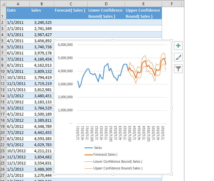
Introduced in Excel 2016 for Windows (it’s not available for Macs), the Forecast Sheet feature uses AI to project values in the future based on past performance. It works with historical, time-based data and creates a chart with high, low, and median projections. The more data you have to work with, the more precise a prediction it makes.
 Microsoft
Using historical data, Excel can project where your data points are headed. (Click image to enlarge it.)
To create a forecast, you must use time-based historical data. Put your cursor in one of the data cells, go to the Data tab on the Ribbon, and in the Forecast group, select Forecast Sheet. On the screen that appears, choose the type of chart (line or bar), the forecast end date, and other options. Click Create, and Excel creates a new worksheet with a chart that contains both the historical data and the predicted values, which are shaded differently than the historical data. This is considered especially helpful for seasonal data.
Quick Analysis
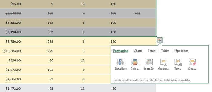
One last tip: If you use Excel 2016, Excel 2019, or Excel for Office 365 in Windows, you can use the Quick Analysis feature to quickly apply an array of visualizations, including conditional formatting, charts, PivotTables and sparklines, to selected data. Highlight the cells you want to analyze, and the Quick Analysis icon pops up near the lower-right corner of the highlighted data. Click the icon and choose the type of visualization you want to add.
 IDG
IDG
The Quick Analysis feature gives you a variety of tools for analyzing your data instantly. (Click image to enlarge it.)
Data visualization in Excel has never been easier.


