Have you noticed that people groan when you pop open a spreadsheet to share your brilliant data insights? Maybe it’s not you — or your audience — that's to blame. Maybe you suffer from Dull-and-Overused-Chart-Syndrome?
Here are 10 charts that can present data in clever ways that make it easy for people to grasp what you're talking about. They don't require people to squint and overthink; instead, these charts do to your data what a photo does to everything else: Show not tell.
You can stop boring everyone with the same old pie slices. Try serving doughnuts or showing them a waterfall. It’s more fun.
Sparklines: A heads-up display for your data
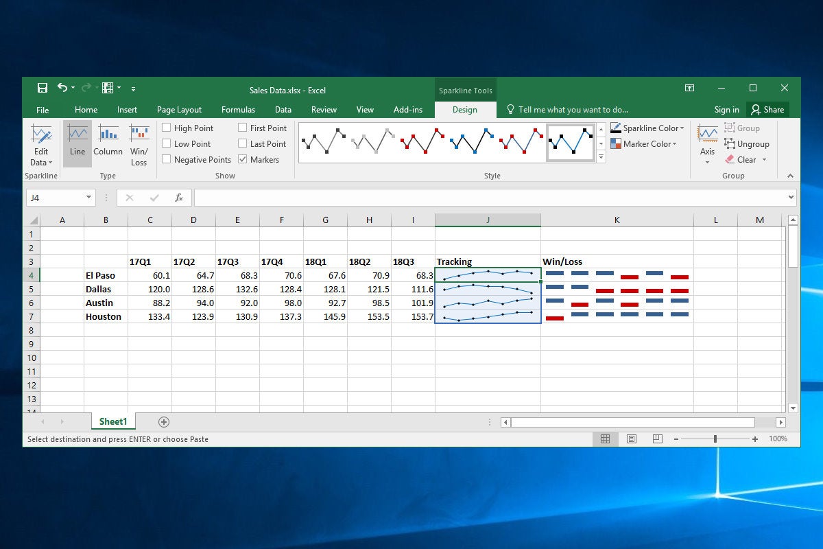
In-cell charts are like a heads-up display for your data, providing an immediate visual context in spreadsheets. The Sparkline feature, introduced in Excel 2013, lets you select data from rows or columns of cells and display line, column or handy win/loss charts.
 Jim Desmond
It’s easy! Just select a range of cells next to the data you want to chart, then click Insert on the UI ribbon and click Line in the Sparklines group (you can also click Column or Win/Loss). In the Create Sparklines dialog box, click in the Data Range text box and select the rows or columns of data you want to depict. The Location Range text box should show the cells used to hold the Sparkline graphs, but you can adjust this by selecting the text in that box and using the mouse to select a row or column of cells. Click OK, and the in-cell charts appear, displaying the data. Select the Sparkline chart cell, click the Design item in the Ribbon, and play with the formatting options to get the look you want.
Make failures jump out with in-cell charts
Sparklines are handy. I especially like the Win/Loss option that displays iconography and color based on whether a value is positive or negative. Use it to, say, normalize regional sales data against projection and flag underperformers. But what if you want to embed visual context within the cell itself, rather than off to the side? Time for some conditional formatting and in-cell charts!
 Jim Desmond
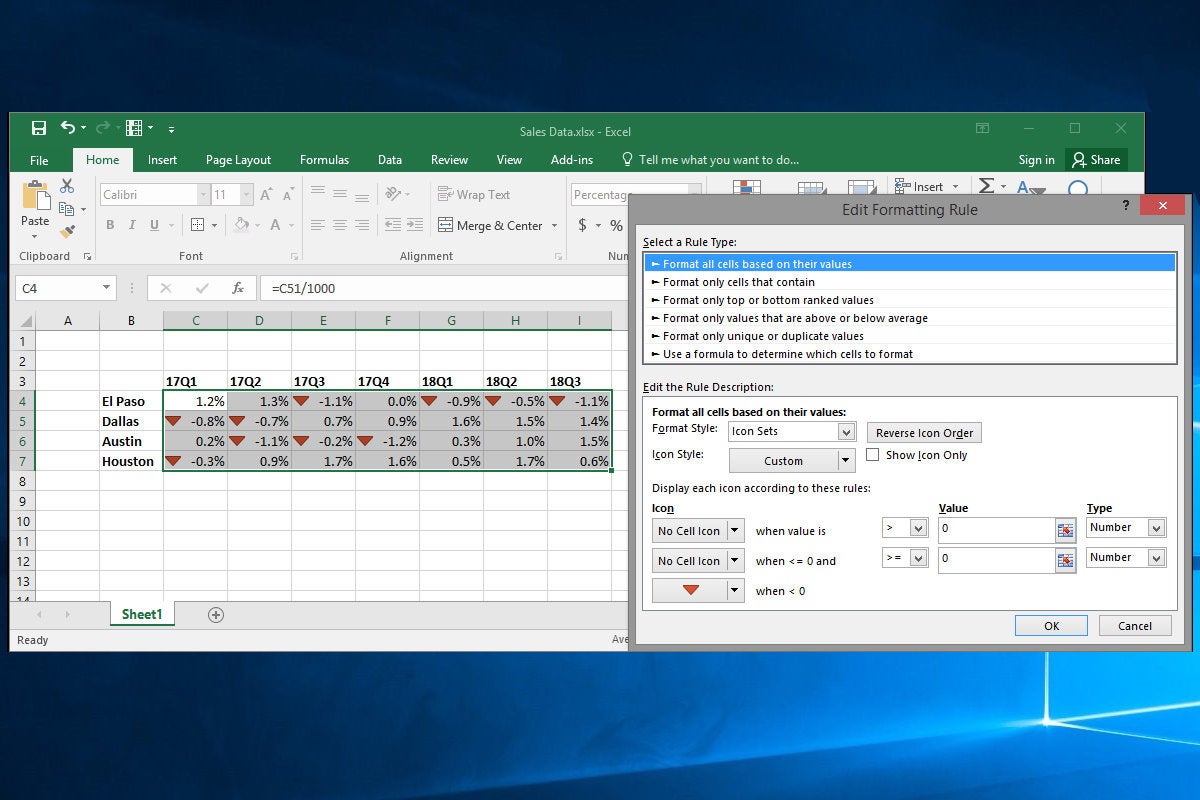
Select a range of data, click the Conditional Formatting item in the Ribbon, and click Icon Sets, then one of the simple options under Directional. Now each data cell displays an arrow icon. But these aren’t aligned relative to zero (and it’s visually quite busy).
So, with the range selected, click Conditional Formatting, Manage Rules, and double-click the rule you just created. In the Edit Rule Description dialog box, set the two top Icon drop downs to No Cell Icon, and the two top Value items to 0. Click the ‘greater than’ drop down and set the first the “>” and the second to “>=”. Set both Type drop downs to Number. In the bottommost Icon item, set the icon to a red down arrow. Click OK and OK again. Now, all negative cells (and only negative cells) are flagged.
Put your smarts on the table
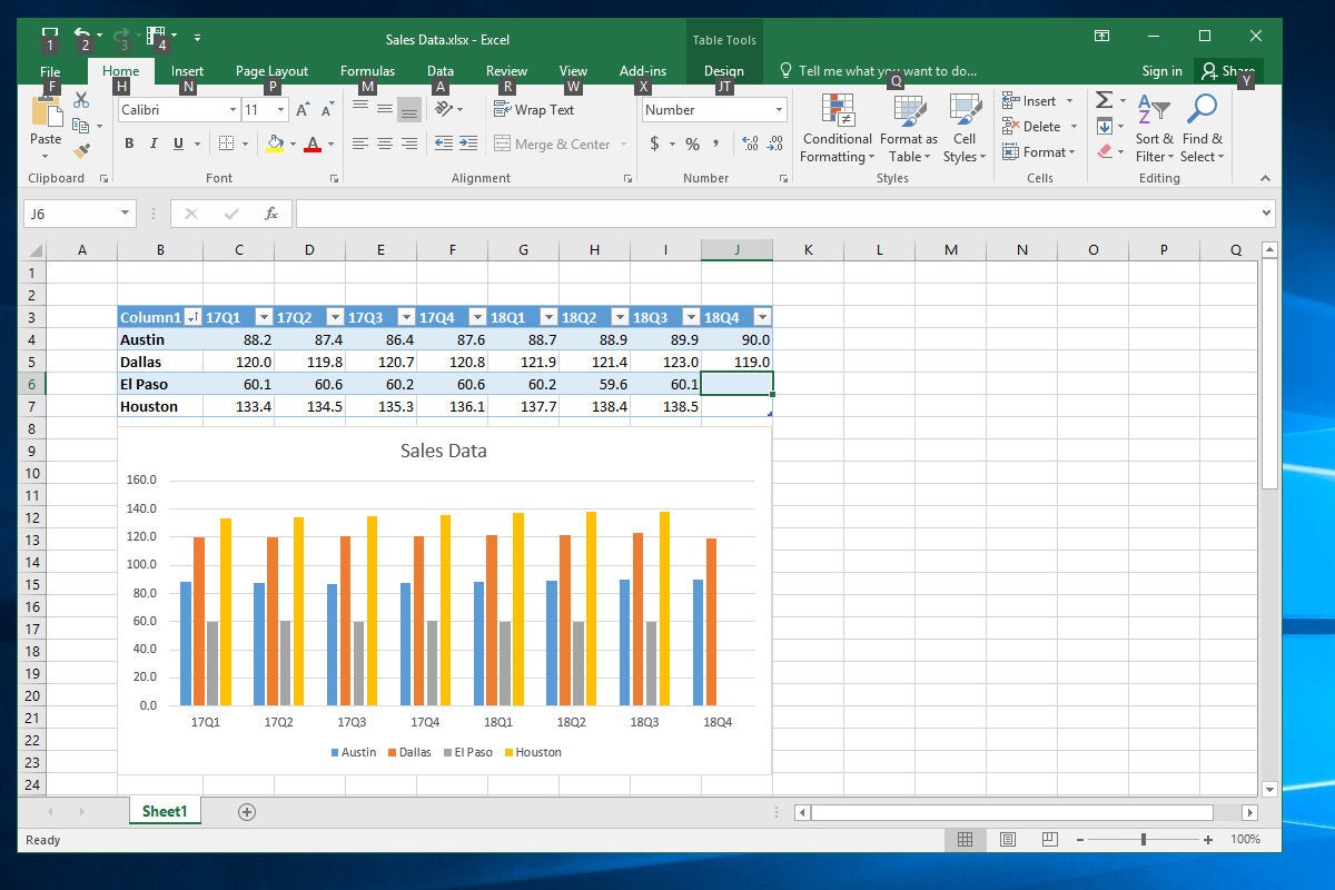
Tables are one of my favorite features in Excel, thanks to the powerful Filter feature that can sort and filter even the largest data sets with a mouse click. But a hidden benefit is the magic it affords your charts. For instance, add a new column of data to the end of a table, and the linked chart automatically expands to add the new data series. Nice.
 Jim Desmond
To Table-ize a data range, select the relevant cells (including header rows and columns) and click Insert, then Table in the Ribbon menu. Make sure the My Table Has Headers checkbox is checked, then click OK. Boom! The data gets some handy formatting and adds filter drop-down controls along the header row. Now, with an embedded chart displayed next to your data, enter a new header row item and some underlying data in the cells below it. As soon as you hit return in the header row cell, your chart resizes and sets aside a new item on the chart axis. As you add data to each cell, the chart updates to display the new data.
Even better, Tables bring the useful magic of Filters to your charts. Suppose you have a table with monthly budget figures from 100 field offices. You can visualize only offices in, say, Ohio, by clicking the Filter drop down in the State column, then unchecking the Select All checkbox, before scrolling down to Ohio in the list and checking it. Click OK and the chart updates.
Sunburst charts: so much better than pie!
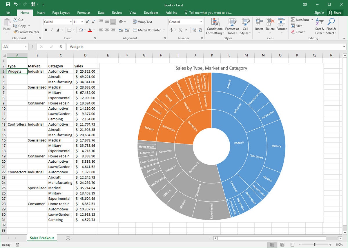
The new sunburst chart type in Excel 2016 is incredibly useful for understanding the relationship among data, taking nested hierarchies of data and showing how the granular elements combine to populate larger data groups. Think of it as a multi-level pie chart.
 Jim Desmond
Sunburst charts in Excel do their thing by reading the structure of your data set. For instance, our fictional company has three strategic product lines (widgets, controllers, connectors) and keeps a spreadsheet that tracks sales for these product lines across industrial, specialized, and consumer markets. They further break these categories out by industry (automotive, medical, etc.). Once the data is properly laid out, select the relevant cells and click Insert, Chart, Recommended Charts, and click the All Charts tab, then click Sunburst from the list.
Waterfall charts for clean, clear data
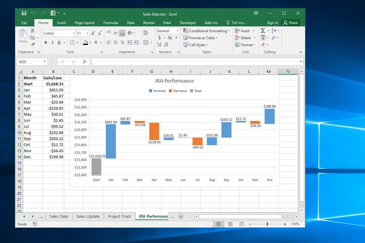
Office 2016 introduces a new chart type to Excel’s arsenal — the waterfall chart. It's great for showing how positive and negative values contribute to a total — like tracking the worth of a financial portfolio over time or visualizing income and expenses. Unlike a line chart, which reveals trends, a waterfall chart emphasizes individual gains and losses.
 Jim Desmond
To create a waterfall chart, make a simple two-column array, with months in the left column and dollar amounts (positive and negative) in the right. Select the array and click Insert and click the Recommended Charts icon. Then click the All Charts tab on the insert Charts dialog box. Click Waterfall in the right pane and click OK. A rather poorly formatted chart greets you.
Next, we will rein in that Y axis so the hefty Start amount doesn’t swamp the other data. Right-click the Y-axis labels and click Format Axis. In the Axis Options pane, enter 15400 and click OK. Then click the Number item and in Category select Currency and, in the Decimal places box that appears, type 0, and press Enter. Finally, set that first data point on the chart as a Total item. Click on the first column in the chart and click on it again so that only that column is highlighted (the others should look faded). In the Format Data Point pane, click the Series Options icon and then check the Set as total checkbox. The selected column now turns gray.
Mmm... doughnuts
Pie charts can be the worst. They lack the visual precision of stacked column charts, and they’re often crowded, reducing smaller data points to inscrutable wedges. What’s more, they invite abuse, in the form of baroque 3D pies and extracted slices that can confuse hapless viewers.
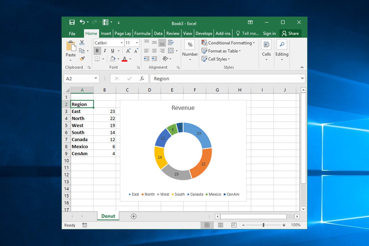
That's why you might consider serving doughnuts the next time you reach for an Excel pie chart. Like pie charts, doughnut charts are great for visualizing contributions to a total. But the additional white space and less common usage make them a refreshing change of pace on the corporate charting circuit.
 Jim Desmond
To create a doughnut chart, select your data, then click Insert, click the Insert Pie or Doughnut Chart icon, and click Doughnut Chart. To tailor the presentation, right-click the chart body and click Format Data Series. In the pane that appears, change the Doughnut Hole Size value to somewhere around 60%. (I find the default 75% is too skinny.)
Roll your own project-tracking Gannt chart
You can turn a stacked bar chart into a project-savvy Gannt chart.
 Jim Desmond
Make a four-column table with "Start," "Stage," "Date" and "On Task" across the top row. In Cells B2 through B7, enter project stages like Plan, Build, Approve, etc. In Cell A2, under Start, enter the start date for the first stage item, then in Cells D2 through D7 (under On Task), enter the number of days for each stage to complete. In Cell C2 enter "=A2" and format the cell as General. You'll see a number like 43205, which is Excel's time/date code needed for the chart layout. Finally, in C3 enter "=C2+D2", then copy and paste this formula into cells C4 through C7.
Select the cells you’ve entered from Column B through D and click Insert. Click the column chart icon and then the stacked bar chart. Now let’s bring the chart into focus. Right-click the X-axis labels and click Format Axis. In the Axis Options pane, click the Number item and, in Category, select Date from the drop-down. In Type, select a shorter date format. Then, at the top of the pane under Bounds, in the Minimum text box, enter the value from Column C of the first item in your task list. It should be something like 43205. You’ll note that the Stages are in reverse order. Right-click the vertical axis and click Format Axis. In the Axis Options pane, click the Categories in Reverse Order checkbox.
Show your goal with a thermometer chart
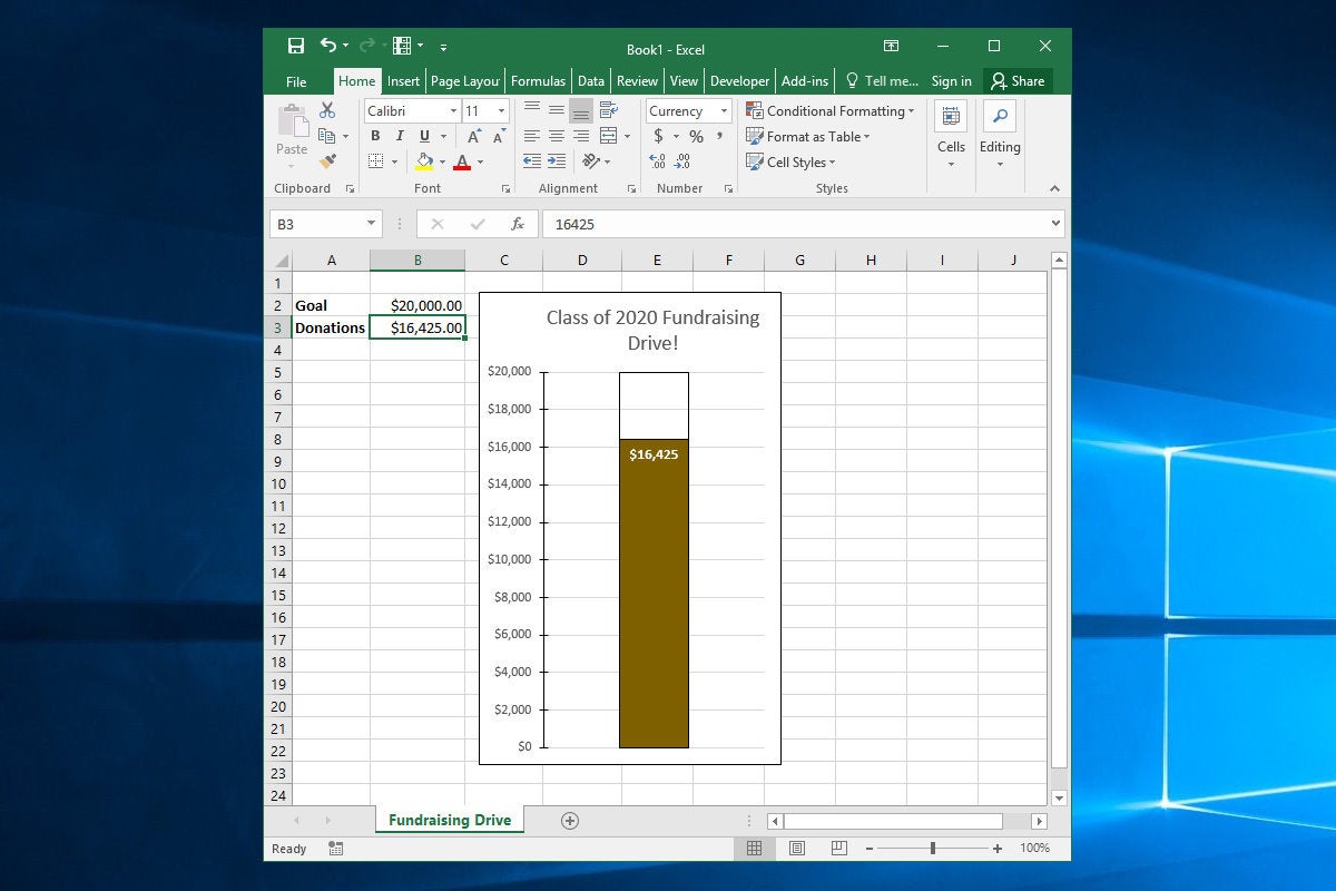
Want to visualize an achievement against a goal? How about a fundraiser trying to raise $20,000? A thermometer chart is great for this.
 Jim Desmond
We’ll keep it simple with a four-cell array with Goal and Donations on the left, and $20,000 and $16,425 on the right. Select the cells, click Insert in the Ribbon, click the Column Chart icon and then click on the Clustered Column Chart item. Click the Switch Row/Column icon in the Ribbon so the chart box displays a “1” in the X-axis label.
Right-click the smaller Donations bar and click Format Data Series. Then click Secondary Axis in the Series Options pane. The bar will disappear behind the larger Goal bar and a secondary Y-axis label appears. Right click the left axis, click Format Axis, and then enter 20000 in the Maximum box in the Axis Options pane. Do the same for the right (secondary) axis.
Empty the Goal bar by right-clicking it, clicking the Fill & Line icon in the pane, and clicking No fill and setting the Border to a black line. Format the Donations bar with a fill color of your choice and setting the border to No line. Clean up the chart by deleting the right axis and the X-axis labels. Also, tighten up the left axis in the Format Axis pane. In Axis Options, set the Number Decimal places box to 0. Add tick marks as you wish.
Charts that change as you enter data
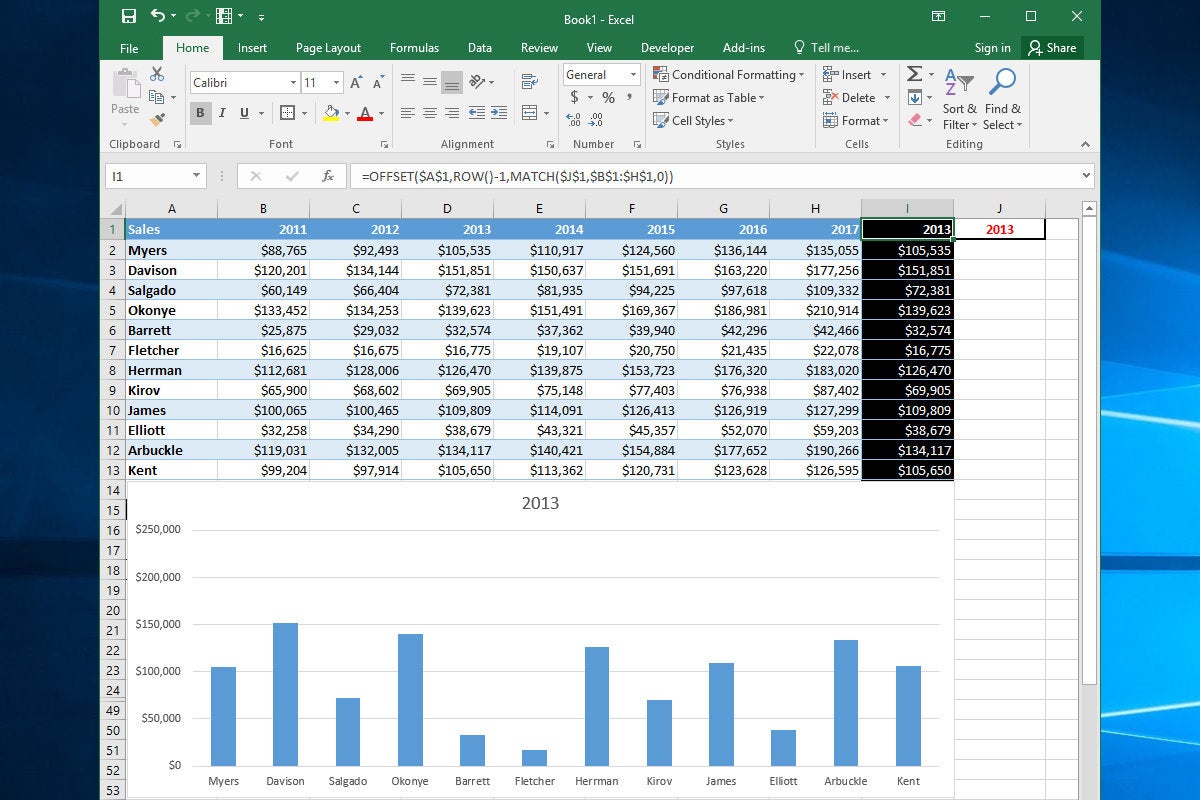
Here’s a trick: an Excel chart that displays specific data from a large array based on your input.
 Jim Desmond
You do this with the (incredibly useful) MATCH and OFFSET functions, which pluck data from an array and present it in cells that the chart is linked to. Let’s say you have seven columns representing years and 12 rows representing sales reps, with the cells containing yearly sales amounts.
In the column to the right of the last column, enter the following formula in each cell:
=OFFSET($A$1,ROW()-1,MATCH($J$1,$B$1:$H$1,0))
This tells Excel to look in the header row of the array for a value that matches the year to cell J1, so Excel can use the OFFSET function to pull the data from that year and display it in the cells in column I. So, if you enter 2014 in Cell J1, the formulas in Column I display the data that’s in the cells under 2014 (in this case, Column E). Now, all you have to do is create a chart that uses column A for its X-axis and Column I for its data. The column will update to display the data for whatever year you enter into Cell J1. Nifty.
More ways to that dynamic chart
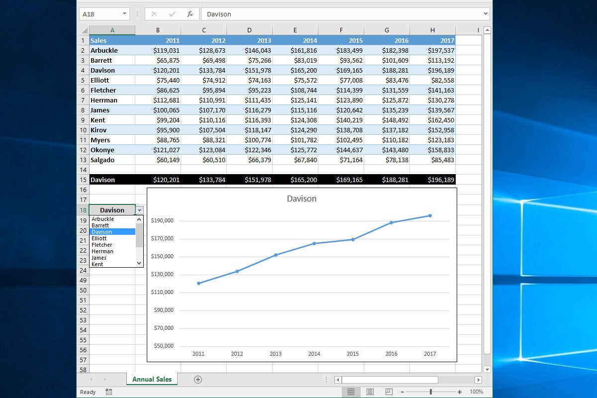
OK, let’s take this a step further and update a line chart based on a scrollable list.
 Jim Desmond
Just below the same array of data we used in the last slide, we’ll use the handy OFFSET and MATCH functions to add cells to Row 15, with formulas that pull sales data based on which rep’s name is entered into Cell A18. These formulas are in cells A15 through H15 and read as follows:
=OFFSET($A$1,MATCH($A$18,$A$1:$A$13,0)-1,COLUMN()-1)
Select Cells A1:H1 (X-axis values) and Cells A15:H15 (rep name and related sales data) and click Insert, Recommended Charts, and select Line chart from the top of the list. Now set up the drop-down list control to read names from Cells A2:A13. Click on A18, click the Data tab in the Ribbon, and click Data Validation and then Data Validation again. Click List from the Allow Drop-Down control, then click in the Source box and use the mouse to select cells A2 through A13. Click OK.
Now when you click on A18, a drop-down control appears. Click it and you’ll see a scrollable list of all your reps’ names. Select one and not only does A18 update to show that name, but the cells in Row 15 all update with that reps’ data, and the linked chart updates as well.


