Imagine if, back in 2010, I had told you we'd reach a point where smartphone hardware would become so advanced that we'd by and large run out of ways to improve it. And so people would start waiting longer and longer to buy new phones — and phone-makers, in turn, would scramble to come up with ways to make each new generation of phones seem sexy and exciting and different from the last.
But they'd struggle — and in their quest to attract attention and convince us to open up our wallets, they'd actually make each new generation less user-friendly and effective than the last. Sure, the shiny new model might look somewhat sleeker than its predecessor, but it'd present a dangerous bargain of sacrificing significant function in exchange for superficial form. And there wouldn't be a damn thing we practical, productivity-minded phone-using mammals could do about it.
Well, here we are. Absurd as it all sounds when put into those terms, that's the high-tech reality we've found ourselves facing — and the mobile tech regression in which we've found ourselves enveloped as of late. Worse yet, the pool of viable high-end options for those of us who wish to avoid that fate is rapidly evaporating.
To wit: An expanding collection of signs suggests Google's next-gen, 2019-model Pixel phone — part of the most advisable Android device line for most people, given its singular focus on a software-centric user experience and its unmatched commitment to timely and ongoing OS and security updates (for a solid three years, compared to most manufacturers' two-ish-year semi-promise) — will join the practical downgrade party. It's just the latest twist in an ongoing trend, but it feels like a final straw in my ongoing annoyance with the devolution of smartphone hardware. It's almost insulting, really, that Google and other device-makers are going so far down this road.
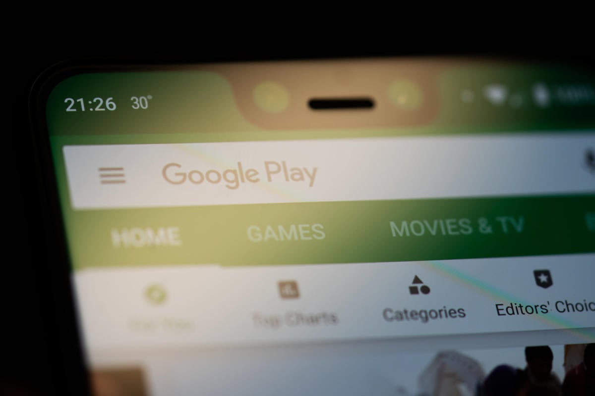
In case you hadn't heard, a fresh set of alleged leaks predicts the upcoming Pixel will attempt to woo prospective purchasers with a low-bezel front, likely enabled by eliminated front-facing speakers and an added screen cutout of some sort (even on the smaller-sized model) — and possibly complemented by an in-display fingerprint sensor instead of the standard back-of-phone pad. While I'm not typically one to put too much stock into a single unsubstantiated leak, we've seen other indications that Google could be considering a "hole punch"-style cutout for the next Pixel's display, and Google itself previously hinted that some sort of progression in that general direction was all but inevitable.
This, as regular readers of this column and my newsletter know too well, is a bit of a soapbox issue for me. So allow me to step up atop that oh-so-slippery perch for a second, and let's explore why exactly this low-bezel trend is such a silly and counterintuitive thing for anyone who actually wants to use their phone as a productivity tool and not just gaze uponst it as a pretty, shiny object.
The big one: The surface-level screen drawbacks
Now, I know: The whole "smartphone notch" argument has really gotten out of hand lately — but, forgive me, I just can't get over it. Every time I see someone out and about using a phone with a big ol' honkin' chunk of its screen awkwardly blacked out and inactive, I can't help but think what a ridiculous and clumsy compromise they've gotten stuck with accepting.
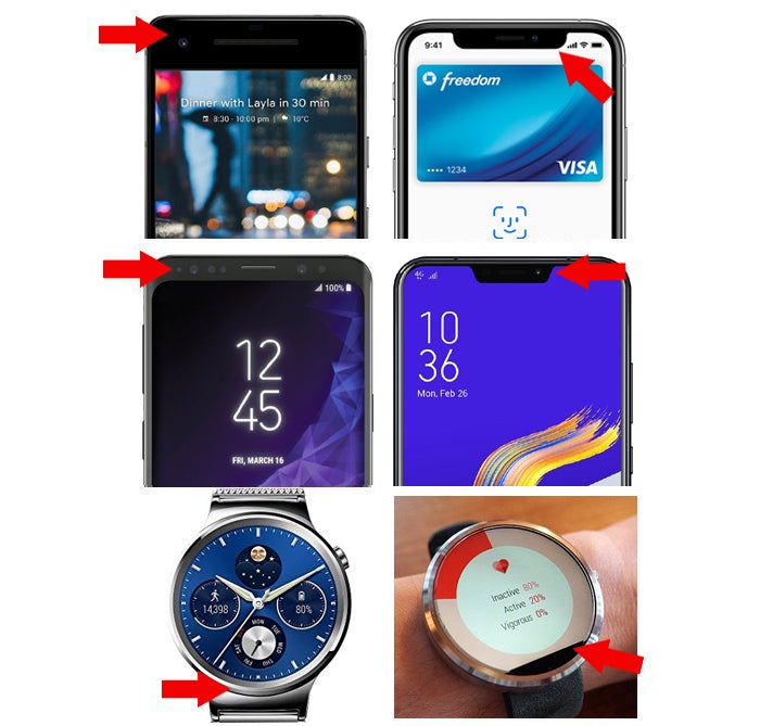
The whole point of the notch — the area of a screen that's dark and inactive, be it in the "hole punch" shape we were just chatting about or in some variation on the more traditional bar or "U" shape — is to eliminate the space around the screen that'd typically hold the camera and other sensors. Y'know, the (gasp!) bezel. Instead, those components go right within the actual screen area, with a cutout in the active display area to make space.
So, to illustrate with some different devices from the recent past, you go from what you see on the left, below, to what you see on the right:
 Google/Apple/Samsung/Asus/LG/JR Raphael
 Riddle me this: Which arrangement catches your eye more and seems more distracting — the subtle border around the display or the freakin' chunk of blacked-out content inside the part of the phone where you actually spend all of your time looking? You've slimmed down the bezel around the display in the latter scenario, all right, but you've taken on a bezeled interface instead. And guess what? As I've noted before, a notch itself is a bezel — a particularly prominent and distracting one, at that. Why do you think device-makers go out of their way to hide those cutouts and provide folks with ways to mask 'em via software?
(And yes, by the way: The Moto 360's much-maligned "flat tire," way back in 2014, was the same exact concept applied to the smartwatch form. It just never caught on and became a widely accepted compromise in that market.)
"But wait, you slithery old codger!" you might be thinking. "What if we were to trade the screen cutout for a front-facing camera that's tucked away inside the phone's frame and made to appear only as needed, as we did with the recently launched OnePlus 7 Pro and its clever pop-up camera?" Well, sure, Shirley, that seems like a slightly less obnoxious arrangement. And technologically speaking, it's quite an impressive feat of engineering.
Ultimately, though, it's still a clunky compromise — and I can't help but ask the same question I pose with all of these low-bezel workarounds: Why bother? Is it really worth the added complexity and caveats (not having the front-facing camera instantly available whenever you want it, adding another bit of machinery that increases the risk of something breaking or wearing out over time, requiring the phone to be thicker in order to house the pop-up camera module, and so on) just to have a somewhat smaller border around the phone's display?
And that's to say nothing of the ergonomic consequences you accept in order to even have a low-bezel setup in the first place. Heck, some Android keyboard apps actually offer a "low-bezel mode" in order to compensate for the suboptimal ergonomics created by the increasingly ubiquitous design trend. How silly is it that such an adjustment needs to exist?!
Worst of all, it won't stop there. Soon, the tradeoff will be for an in-display front-facing camera that seems to solve the problem but instead introduces the inevitable added compromise of subpar photo quality. Sigh.
And all of that is still only the start of this digital deal with the devil.
A subtle side effect: Worse speakers
Underwhelming smartphone speakers are nothing new, but some phones — like the Google Pixel that sparked this whole conversation — have bucked the trend with front-facing stereo speakers that give you halfway decent sound for on-the-go video watching, video chatting, or whatever other aural adventures you may find yourself engaged in.
You know what isn't compatible with front-facing stereo speakers, though? Yup, you guessed it: eliminating every trace of a bezel on a phone's face. Without a bezel in place, there's nowhere for those speakers to go other than out of the way and into a non-front-facing area of the phone — where they'll be less effective at, y'know, delivering audio to your ears.
It's yet another tradeoff of function for form, with the sole gain of eliminating a teensy bit of space around the phone's frickin' screen.
And finally, the icing on the cake:
The fingerprint scanner downgrade
This isn't directly related to the low-bezel quest, necessarily, but the two certainly seem to go hand in hand: As phone-makers continue on their mission to create more "modern" and different-enough-to-justify-buying phone designs, they're frequently eliminating the traditional and highly effective rear-facing fingerprint scanners — the ones like we've seen on Google's past Pixel phones, which line up exactly where your finger naturally lands while holding the phone — and replacing them instead with in-display fingerprint scanners.
Anyone who's spent any time with a variety of smartphones will tell you the same thing: These in-display fingerprint scanners are, without exception, awful to use. They're slow, inconsistent, and awkward. They're a major step down in usability from what we had before, in other words — and for most of us, they're something we rely on dozens of times a day. That's no small downgrade.
Does an in-display fingerprint sensor seem sexy, futuristic, and cool — particularly when you pair it with a sleek low-bezel phone that's free from most visual interruptions? You betcha. But are you gonna pay the price for that superficial appeal with what the thing is actually like to use? You'd better believe it.
Déjà vu all over again
To quote a devastatingly handsome writer I know, as with anything, a reasonable balance needs to exist here. Of course squeezing more screen into a phone's frame is a positive thing — up to a point. But taking that to the utmost extreme and attempting to eliminate bezels altogether, no matter the practical cost, is doing something because we can rather than because we should. And the difference between those two methods is critical to consider.
All of the changes we've just discussed are workarounds — inelegant compromises put forth in order to reach a goal that has little to do with our best interests as long-term users of these devices. Call me crazy, but y'know what would be a more elegant and effective way to make this stuff work? A subtle and not at all distracting bezel that holds the camera above the blasted display — and a fingerprint sensor that sits in the just-right place on the phone's back and works instantly, every time you tap it.
My only hope is that — like other silly smartphone trends force-fed to us before — this, too, shall pass. Think back to the thinness wars we saw with smartphones some years back, where every new device had to be the "thinnest ever made" — even when said thinness provided no practical value and made the phone both uncomfortable to hold and unnecessarily short on battery life. Or think back to the era when phone-makers' obsession over the number of pixels in a display led to pocket-sized devices with 4K screens that accomplished little more than short-changing us on stamina. On both fronts, after a while, most device-makers stopped obsessing over silly superlatives and found a sensible balance to strike.
Maybe, just maybe, we'll reach that point eventually with this current bezel craze. Or maybe the technology will catch up first and make the workarounds a little less repugnant.
Until one of those things happens, though, it seems we'll be stuck accepting unnecessary compromises in order to help device-makers move products — or, alternatively, stuck shifting ourselves downward to the thus-far-unaffected midrange phone realm in order to avoid the downsides of this "progress."
Welcome to the future.
Sign up for my weekly newsletter to get more practical tips, personal recommendations, and plain-English perspective on the news that matters.

[Android Intelligence videos at Computerworld]


