When you talk about Google's Pixel Fold, it's tough not to focus mostly on the phone's form.
I mean, this is a device whose screen folds in half, for cryin' out loud! It may not be the first Android phone to feature that feat, but still: It's without a doubt the device's defining characteristic. And it's quite a sight to see, even in passing, and even more so to experience in your own pockets and person-paws.
While it's easy to obsess over the Fold's fold, though, we've been there and done that at this point. And now that I've personally been totin' the Pixel Fold around in my pantaloons for a solid month (somehow!), I want to move beyond the surface and focus a little more closely on what might actually be the Fold's most significant innovation from an Android-wide, platform perspective.
Here's the thing: The folding screen sure is something — to say the very least! — but it isn't exactly gonna be a standard productivity tool anytime soon. It'll be a good long while before most average Homo sapiens have folding phones, if such a time ever arrives, and so the immediate impact of the form is pretty darn limited.
But the true brilliance of Google's Pixel Fold philosophy is something that's actually unrelated to the form itself. And it's something that could — and arguably should — affect anyone using any Android device, regardless of its form or foldability.
[Psst: Got a Pixel? Any Pixel? Check out my free Pixel Academy e-course to uncover all sorts of the advanced intelligence lurking within your favorite Googley phone!]
Let me explain.
The Google Pixel Fold philosophy
Once you get past the oohing and ahhing around the Pixel Fold's spacious inner screen, what really sticks out in using the device is the series of software enhancements Google made to make the most of that expanded environment.
Specifically, Google dramatically rethought its approach to multitasking on Android. And as part of that, it both introduced new interface elements and dug up long-existing software features to make 'em more prominent and important parts of the phone-using experience.
Three pieces of the puzzle in particular stand out — and, interestingly enough, they're all present on the Pixel Tablet, too. More than anything, as I've spent time with both of those devices, I've found myself (a) noticing how aligned the two products are in their interfaces and the experiences around 'em and (b) wondering why those experiences aren't yet standard on all Android devices.
First things first, both the Pixel Fold and Pixel Tablet introduce a new on-demand dock that completely changes the way you think about getting around Android. It's like a smarter version of Android's long-standing recent apps interface: You simply swipe up slowly from the bottom of the screen, no matter what you're doing, to reveal a snazzy new bar that shows the same docked favorites from your home screen along with an extra spot for a dynamically changing suggestion and a shortcut to pull up your full app drawer from anywhere, anytime.

And that's just the start. Second, in addition to making it easier to switch apps on the fly with the dock, the specialized Android software on the Pixel Fold brings Android's long-buried split-screen feature to the forefront by allowing you to drag any app up from the dock into either side of the screen to start an instant split-screen view.
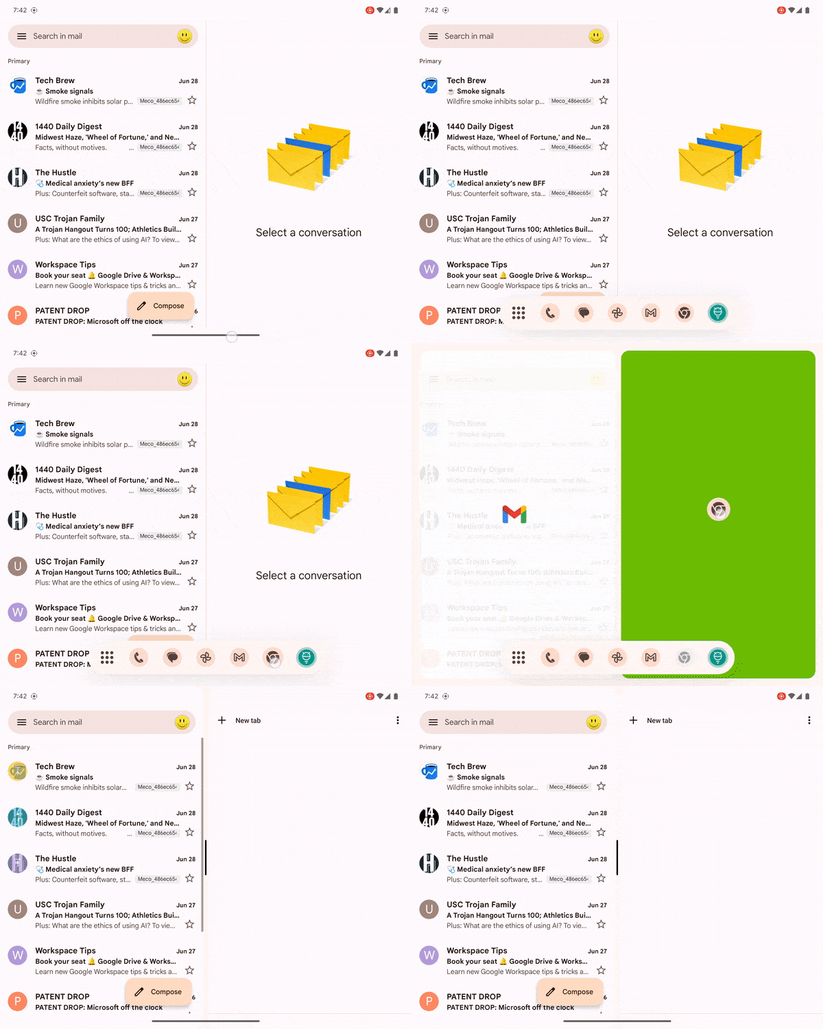
Third, and last but not least, that same mentality slides into the standard Android notification panel. There, you can drag any notification down to fire up a split-screen view with the associated app, no matter what else you might be doing on your device at the moment.

Together, these additions go an impressively long way in transforming the Android multitasking experience. They create a simpler, more intuitive way to move from task to task, and they turn Android's long-underappreciated split-screen capability into a natural, integrated, and native-feeling option you're actually likely to use.
That's quite the contrast to how split-screen has existed on Android traditionally — something best described as out-of-sight, out-of-mind and rarely used (or even remembered!) by most mammals in the real world.
Now, for that bigger-picture potential...
Rethinking Android multitasking — beyond the Pixel Fold
More than anything, the software enhancements Google's created for the Pixel Fold seem like such sensible additions that I find myself wondering how they didn't exist in Android up until now. And I find myself missing 'em whenever I move back to a standard Android device — or even when I'm using the Pixel Fold's outer display, which strangely doesn't support any of those same options.
To a certain extent, I understand why. The screen-splitting possibility lends itself most naturally to a larger screen, with more space — which is something the Pixel Fold's internal screen and the Pixel Tablet's tablet-sized display obviously provide.
But if Android's gonna offer screen splitting in any capacity, it'd make so much more sense for it to be integrated into the operating system in a logical way like this, instead of being awkwardly tacked on and tucked away in a menu few mere mortals will ever think to explore (as, again, is presently the standard on most typical Android devices).
And lemme tell ya: Having that option be so front and center and built into the core Android interface makes a world of difference in keeping it front of mind and making it both natural and intuitive to use. And having that possibility perpetually at your fingertips really does open the door to some interesting new ways of getting stuff done on the go, too, since it's easier than ever to view your inbox alongside a document or view a Slack chat next to a web page and interact with the two things together.
But even if we set the screen-splitting considerations aside for a moment, the Pixel Fold-style dock in and of itself is just an absolutely brilliant addition and one that would be equally valuable on any size device. Once you see how simple it is to move between apps with that element available — and without ever having to return to your home screen or flip through an inherently limited list of stuff you'd had open recently — it's hard to go back.
The more I use the Pixel Fold and its larger Pixel Tablet companion, the more convinced I am that these are the features that matter the most and could have the widest reaching impact across all of Android (and potentially even beyond, if other platforms were to eventually copy the concepts).
The only question now is if and when Google will reach that same conclusion and make these elements available in any Android context. If we're lucky, maybe, just maybe, that moment will arrive sooner than later.
Hey, Android 15: We're lookin' at you.
Don't let yourself miss an ounce of Pixel magic. Sign up for my free Pixel Academy e-course and discover tons of hidden features and time-saving tricks for your favorite Pixel phone.


