Not long ago, the Google feed — the stream of card-based info at the left-most side of your Android home screen and/or inside the Google mobile app — was something uniquely spectacular.
"The predictive future of search," proclaimed The Verge — a "sign that all the different parts of Google are finally working together in a cohesive way."
"A service that shows users vital information before they actually go searching for it," noted Time — with info that's "increasingly sophisticated."
"Android's new secret weapon," said some strikingly handsome guy — "a natural progression in putting our devices one step ahead of us and making them feel like extensions of ourselves."
High praise, all around. And rightfully so.
For years, the Google feed — known formerly as Google Now — brought the countless tidbits Google knows about our lives and our world together in a fantastically useful way. You could glance at the feed from your phone with a single touch of your finger and see all sorts of genuinely helpful info, catered specifically to what was relevant to you at any given moment.
 Google/Archive.org
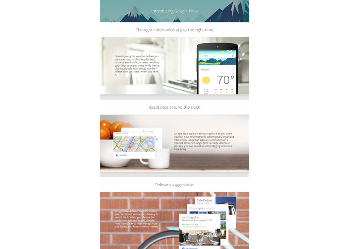
 Google Now, circa 2014: Predictive intelligence at your fingertips (click image to enlarge)
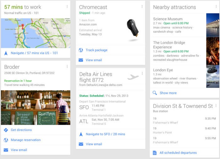
The service combined bits and pieces from your email, calendar, search history, and location data to create a powerful cocktail of personalized, predictive assistance no other company could come close to providing. You might see a card letting you know when you needed to leave for an upcoming appointment, for instance, based on details from your Google Calendar along with location data from your phone and current traffic conditions from Maps.
You might get up-to-the-minute info on a flight you searched for earlier from your computer — or status updates for an upcoming flight you booked months ago, thanks to the confirmation email that landed in your Gmail inbox at the time. You could see info about restaurants near your current location or the commute time to a place you typically visit on a certain day and time. The list goes on and on.
 Google/Archive.org
 Some of the many practical and predictive cards in Google Now's earlier incarnation
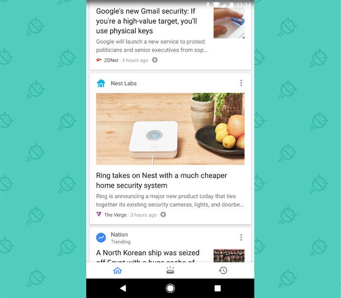
Now? The Google feed, at its core, has basically become a glorified news stream. Open up the feed, and what you'll find is a series of stories presented in cards. It's a reasonably nice news stream, mind you — one that uses your past searches and stated preferences to show a personalized blend of content intended to match your interests — but at the end of the day, it's just yet another place where you can scroll through headlines.
 JR
JR Wait — what?
As for all the stuff that made Google Now and the Google feed special — all the sophisticated predictive info based on Google's unmatched repository of personalized and real-time data — it's been relegated to an out-of-the-way secondary panel most folks will likely never even notice, let alone look at with any regularity. Instead of being front and center and part of the service's raison d'etre, the predictive cards' presence feels like an awkwardly tacked-on element to a clearly pivoted product. One seemingly simple shift dramatically changed the app's very nature and primary purpose.
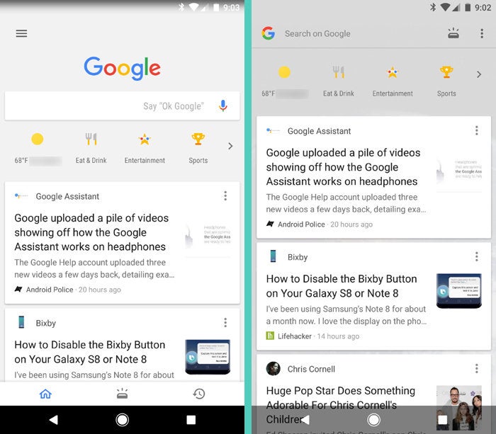
And the new arrangement isn't even consistent: In the main Google app, the predictive cards are accessible via a cryptic hieroglyph at the bottom of the screen. (See below. Seriously, what's that icon supposed to be?!) On Android phones where the Google feed is built into the home screen itself, meanwhile — including Google's own flagship Pixel devices — that same ambiguous icon is inexplicably in the top-right corner of the screen.
 JR
JR The Google feed in the Google app, at left, and on the home screen, at right
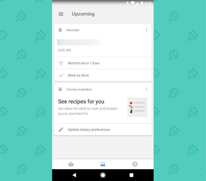
The clunky implementation gets even more confusing from there: Tap the predictive info icon in the home-screen-based feed, and you'll be taken to the similar-yet-just-different-enough-to-disorient-you Google app interface — where all the icons suddenly shift around on the screen.
 JR
JR Predictive intelligence: The Google feed's inconsistent interfaces are going to drive you batty
Getting a headache? Yeah — me, too.
Interface oddities aside, the big-picture reasoning for Google's repositioning of the service isn't tough to suss out. As my comrade Casey Newton put it back when the newly refocused feed first debuted:
With each passing year, we have had fewer reasons to open the Google app. Native apps from Facebook, Amazon, Apple, and others command more of our attention, making us less likely to begin our queries at the search bar. More recently, Siri, Alexa, and Cortana have been built into our device hardware, allowing us to bypass Google and search with our voice. Financially, Google is still on solid footing. But the trends are worrisome.
Google, in other words, is chasing its competitors in the race for our attention and trying to make sure it remains relevant as a "starting point" in our increasingly crowded digital lives. And sure, on the surface, such an effort makes sense. But is parroting what everyone else is doing while downplaying its own singular strengths really the path to success?
After all, pushing the feed's once-prominent predictive intelligence element into the background redefines what the service is all about. For all practical purposes, the Google feed isn't a productivity-oriented predictive intelligence provider anymore. It's a news reading service, with a few other bells and whistles sprinkled in. It's lost its soul, its identity. It doesn't seem to know what it wants to be.
Five years ago, Google Now felt like the future. Today, the Google feed feels like the past — like a mildly different spin on a ubiquitous concept and a step backwards from what Google achieved when it put the full power of its resources front and center. It comes across as more desperate than daring. And for those of us on Android in particular, where predictive intelligence was once an exciting marquee element of the operating system, that's a damn shame to see.
[UPDATE: In a possibly related footnote, I was reminded of a 2015 story from Recode describing an apparent "exodus" of the original Google Now staff. According to the article, the engineers were frustrated with the way the company had started to frame their creation following the shift in Google's leadership that summer. It doesn't seem like much of a stretch to draw a line from that to the ongoing transformation we've seen with the product in the months since.]


