Chromebooks started out all about simplicity. Lately, though, they've gotten kinda complicated.
Maybe it's an inevitable side effect of growth — or maybe just the piecemeal manner in which Google's Chrome OS platform has expanded — but Chromebooks today have so many program-running possibilities, it's damn near impossible to keep 'em straight. The computers can still run web apps, of course, just like in their earliest days, but they also now support the similar-looking-but-more-powerful progressive web apps, the on-their-way-out-but-still-present Chrome apps, the familiar-from-your-phone Android apps, and even the clunky-but-capable Linux apps. Sheesh!
It's enough to make anyone's head spin — and most dizzying of all, those app types overlap in some pretty perplexing ways. If you want to use Google Photos, for instance, you can rely on the regular web app, snag the progressive web app, or install the Android app for the service. Need to hop on a Zoom call? You can grab the Chrome extension, install the Android app, or even give yourself the Linux version. Each option offers a slightly different experience with slightly different features, and they're absolutely not all equal.
As a result, it practically takes a cheat sheet to figure out and remember which type of app is best for which purpose and where you should go to find it. (The Chrome Web Store? The Google Play Store? The, uh, whatever place you're supposed to go to find progressive web apps or Linux apps?!) Or, if you're like most casual Chromebook users, you might just look at whatever source comes to mind first without even considering the other options.
The complexity of the Chrome OS app situation has become a real problem, as I've learned from talking to countless Chromebook owners who are overwhelmed by the labyrinth of overlapping options. Versatility is a strength, for sure, but it can also end up being a weakness when it isn't presented properly. And that's a real head-scratcher to solve: How do you bring all these different and often-duplicative app types together in a way that's effortless to understand and simple to manage?
Well, after many months of messiness, it seems Google may finally be onto a solution — or at least the start of one. And it's easy to imagine its implications eventually stretching even further than this one single platform. (Hint, hint: Android. More on that in a minute.)
The Chrome OS app answer
So here it is: Google appears to be working to position the Play Store as not just a place for Android apps, as it's traditionally been, but as a broader one-stop shop for multiple types of apps on Chromebooks — with the store itself determining which app type makes the most sense for any given purpose and then installing the appropriate option for you.
It's simple. It's thought-free. And subtle of a shift as it may seem, it goes an impressively long way in detangling the web of complexity that's been present in the Chrome OS app ecosystem for quite a while.
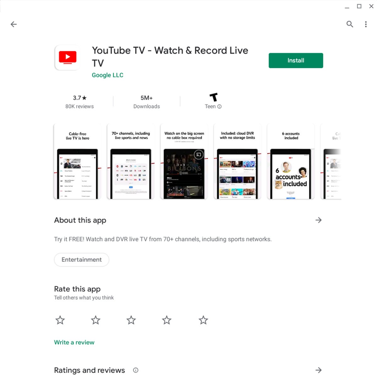
Now, all things in perspective: So far, this new setup is known to exist in precisely two places, as initially discovered by the website Chrome Unboxed: in the Play Store page for the Twitter app and the in Play Store page for the YouTube TV app. And what's especially interesting is that those pages don't look any different than any other app pages on the Play Store — and in fact, there's no real indication you're receiving anything other than an Android app when you visit 'em.
 JR
JR
The YouTube TV Play Store page, as seen on a Chromebook — nothing out of the ordinary.
When you click the Install button on either page from a Chromebook, you end up with a lightweight app that looks like an app, acts like an app, and feels like an app. If anything, it comes across as an especially good app: It opens quickly, runs smoothly in any size or orientation, and works perfectly well online or off. It's only if you're an astute observer (read: total nerd) that you'll notice it's not actually the Android app you're using but its progressive web app cousin. And that's exactly how it should be: No normal person needs to know or think about what type of app they're using at any given moment. They should just be able to go to a single, obvious storefront, find the software best suited for their current environment, and install it — then know it'll work well from that point forward.
 JR
JR
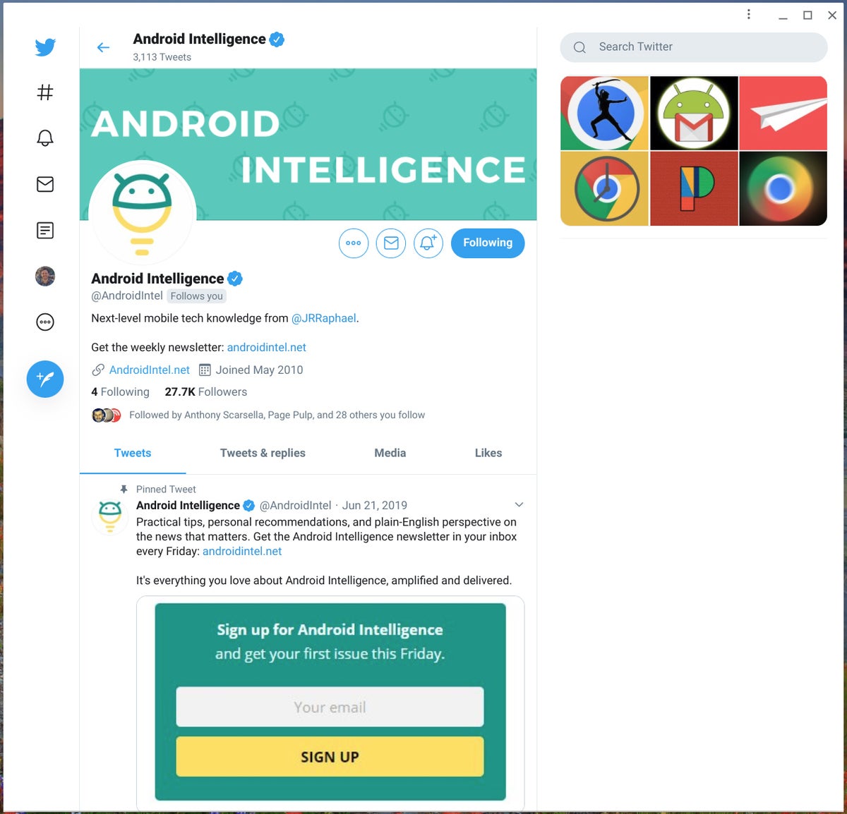
Looks like an app, acts like an app, and feels like an app — but despite coming from the Play Store, this is actually Twitter's fully responsive progressive web app.
And lest you think this is a mere fluke, a Google manager who works on Chrome OS and apps tweeted about the topic and described this as being Google's "strategy" and "some of the most challenging and satisfying engineering work" he's ever performed.
That sure makes it sound like what we're seeing now is only the beginning of a broader effort to turn the Play Store into a streamlined source of apps for Chromebooks — and, who knows, maybe eventually other types of Googley products.
It isn't as much of a stretch as you might think.
The bigger Play Store picture
Consider this: Google's been experimenting with the idea of progressive web apps on Android for a while now. The company already makes it possible for developers to embed such programs within traditional Android app structures and then put those into the Play Store. How far of a leap would it be to start offering up standalone progressive web apps directly in place of Android apps for phones, too, in circumstances where that'd be optimal?
I'll tell you this: I have some standalone progressive web apps on my own phone, and while I stumbled onto 'em mostly by accident (it's basically a crap-shoot when you try to add a website to your home screen at this point), they're surprisingly pleasant to use — in a way that almost makes you forget you aren't using a regular, native Android app. Just sayin'.
But back to Chromebooks: When you combine this latest development with the pending demise of Chrome apps and the repositioning of the Chrome Web Store as a place strictly for browser-specific themes and extensions, Chrome OS's convoluted web of apps suddenly starts looking a lot less complicated. And especially once you remember that Google recently added an all-in-one app management screen into the Chrome OS system settings — a single place where you can see, adjust, and uninstall any of your apps, regardless of their nature — it's easy to regard everything we're seeing now as the seeds of a new and simpler Chromebook app arrangement.
The one area not yet included is the realm of Linux apps on Chrome OS, but that's still considered beta-level, experimental territory — not something for average schmoes to tinker around with (yet). And we've actually seen signs of Google at least thinking about making it possible for us to find and install Linux apps in some sort of simplified, streamlined manner. We've also seen the Chrome OS team playing around with ideas for a system-level "App Service" that'd bring all the platform's different app types together in a way that suddenly seems strangely familiar.
Put all these pieces together with the apparent new strategy to use the Play Store as a primary storefront, and you've got the potential to turn Chrome OS's mishmash of overlapping app types into a more unified software experience — one where what type of app you're using almost becomes irrelevant. Instead of thinking about Android apps, Linux apps, or progressive web apps, they'd all just become Chromebook apps from the user's perspective.
It's still a tall order, and we certainly aren't there yet. But this latest step gives me hope that Google might finally be on the right path — and maybe, just maybe, might be on its way to bringing back a touch of the simplicity Chrome OS once had but then lost along the way.
Sign up for my weekly newsletter to get more practical tips, personal recommendations, and plain-English perspective on the news that matters.

[Android Intelligence videos at Computerworld]


