Now you see it; now you don't.
As any Android fan can tell you, Google's become a bit notorious for changing its mind. One day, we hear about how some new app, feature, or idea is the way of the future and the answer to all of our pressing problems — and the next day (or so it often seems), that notion is mysteriously gone and forgotten.
The best fickle flipples are when Google doubles up and does another 180 soon thereafter and ends up going back to the thing it initially sold us on and then abandoned. It's enough to make even the most stable tech enthusiast bemused and befuddled.
With a handful of fresh about-faces getting added into the mix in recent months, I thought it'd be a fine time to look back at some of Google's most memorable, amusing, and occasionally groan-inducing U-turns here in the land of Android and other associated apps and services.
So buckle up and grab a bottle of Dramamine, just in case. Some serious flipping-and-flopping-caused flabbergasting is straight ahead.
1. Android: "Hangouts is gonna be Android's single default messaging client!"
We'll start with the biggest, floppiest flip of all: the mess of Google's ever-evolving approach to messaging services, especially as they pertain to Android.
After a long and often-confounding journey, Google finally got its act together in 2013 and came up with a single unified messaging app for Android. Hangouts would be the "single communication app [for] users to rely on," a Google exec said at the time. It'd handle instant messaging, SMS-based texting, and even internet-based audio and video calls.
At last! Android's rusty old Messaging app was dishonorably discharged, and Hangouts started to serve as the platform's default messaging application. Until about two years later, that is, when Google Messenger came along and took over the default spot — splintering things back into a muddled messaging mess.
And that, of course, was only the beginning. (Allo? Can you hear me?)
2. Everywhere: "Google Messages and Duo are for casual consumer use! Google Chat and Meet are for businesses!"
Speaking of messy messaging about, erm, messaging, after many more years of complicated confusion and no consistent focus on a sensible messaging service strategy, Google got its act together again in 2018 and settled on a new approach that actually almost made sense (if you allowed yourself to forget the past for a moment).
Ahem: Messages and Duo were the text and video messaging apps for consumers, while Chat and Meet were the group chat and videoconferencing apps for enterprises. Google made this distinction abundantly clear, with a member of the messaging team going as far as to create and share a handy chart that illustrated the breakdown:
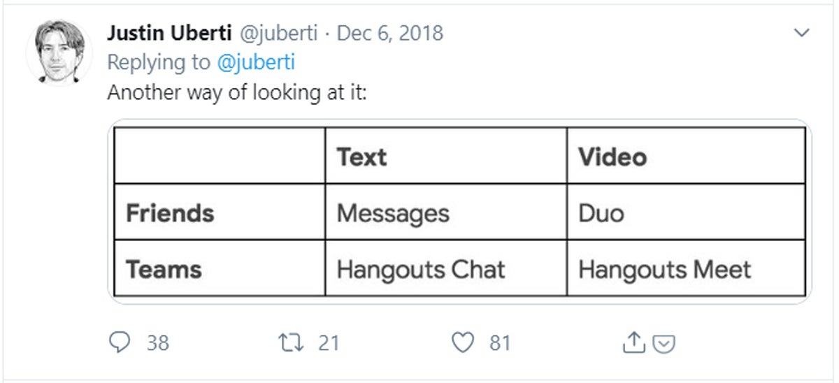 Twitter
 But then — well, y'know. By 2020, Google changed its mind about that and made Chat and Meet broad-use services, for both teams and individuals, while Messages and Duo remained minimally different variations on the same basic concepts.
And here's a bonus U-turn within this U-turn: Last fall, Google brought screen sharing into Google Duo...two years after removing that very same feature from the app.
Cool. Cool, cool, cool, cool, cool.
3. Android (and beyond): "RSS is dead!"
Way back in the prehistoric era of 2013, Google made many of its most loyal users steaming mad by announcing the shutdown of its popular (at least in certain circles) Google Reader service. Reader was a tool for following RSS feeds from individual websites, which made it super-easy to create your own custom feed of info from the sources you cared about the most.
In its 2013 announcement, Google said that "usage of Google Reader [had] declined," and "as a company, [it was] pouring all of [its] energy into fewer products" — because it thought "that kind of focus [would] make for a better user experience."
Fast-forward to 2021, and what do we have? Why, it's a new "experiment" that basically recreates the Google Reader concept right within Chrome on Android!
Per that announcement:
Today, people have many ways to keep up with their favorite websites, including subscribing to mailing lists, notifications, and RSS. It’s a lot for any one person to manage, so we’re exploring how to simplify the experience of getting the latest and greatest from your favorite sites directly in Chrome, building on the open RSS web standard. Our vision is to help people build a direct connection with their favorite publishers and creators on the web.
The feature brings a new "Follow" button into the Chrome Android app that lets you subscribe to a site's RSS feed and then see all of its latest stories in the browser's New Tab page.
Gee willikers, that sure does feel familiar.
4. Android: "Bottom tab bars are bad, mmkay?"
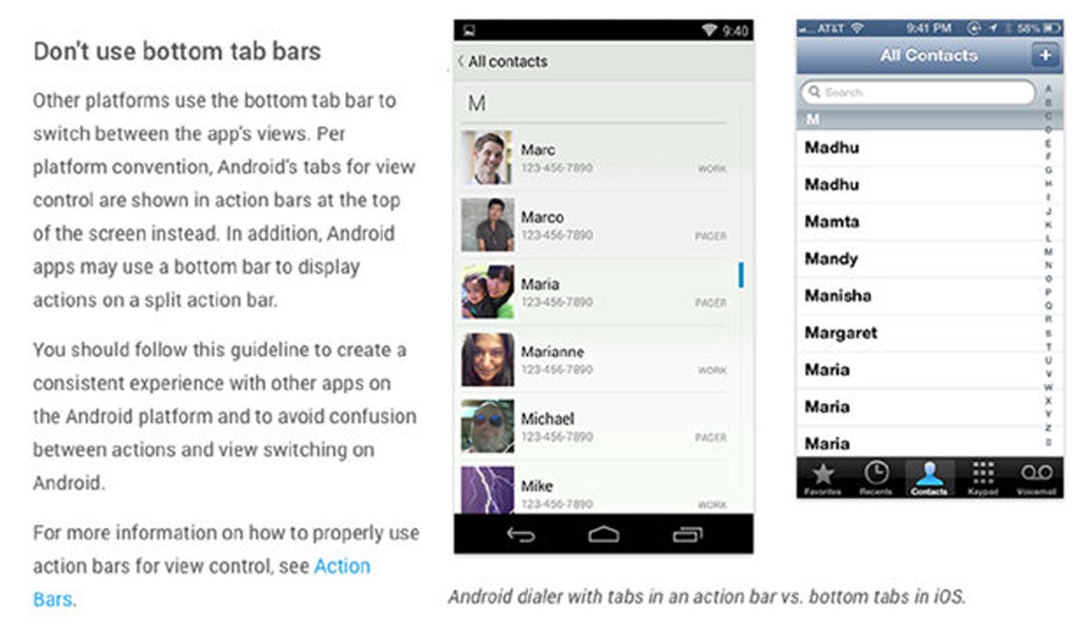
When Google's Material Design standard debuted in 2014, it actively discouraged the use of bottom tab bars — the iOS-reminiscent rows of commands that appear at the bottom of the screen within Android apps.
This was no subtle suggestion, either. Google's official design guidelines were adamant about the platform's stance on the bars:
 JR
JRBut then, something changed. Within a couple years of that proclamation, bottom tab bars started appearing in Google's own Android apps. And by 2016, Google's design guidelines were updated to encourage the use of bottom-dwelling boxes in Android applications.
And here's the real kicker: Over the past year, we've seen some Google apps get updated again to do away with the bottom tab bars and move back to that original bar-free standard — for a little while, at least.
Oh, Google.
5. Android: "We're gonna put all your browser tabs in the Overview list!"
Speaking of design about-faces, with 2014's Android 5.0 Lollipop release, Google made a bold move: It took the ability to jump between browser tabs out of the actual Chrome app and put it into the system Overview list instead. Each browser tab would look like its own app or process, we were told, and it'd make perfect sense alongside all the other apps and processes in a single system-level destination. We'd get used to it!
Only, um, we didn't. For most people, having tons of tabs mixed in with apps and countless other cards made things more difficult to manage — and only added to the cluttered and confusing nature of the Overview interface in that era.
After about four years, Google seemed to admit that the move was misguided. In 2018, the company rolled out an update that eliminated the tab-Overview option and brought tabs back into the browser for everyone.
6. Android: "Widgets should go in the app drawer!"
The Android 4.0 Ice Cream Sandwich era of Android was all about taking the simplification introduced in the tablet-only Honeycomb release before it — the moves to eliminate hidden commands and make the operating system more intuitive — and bringing those same concepts to phones in a way that made sense for the smaller screen.
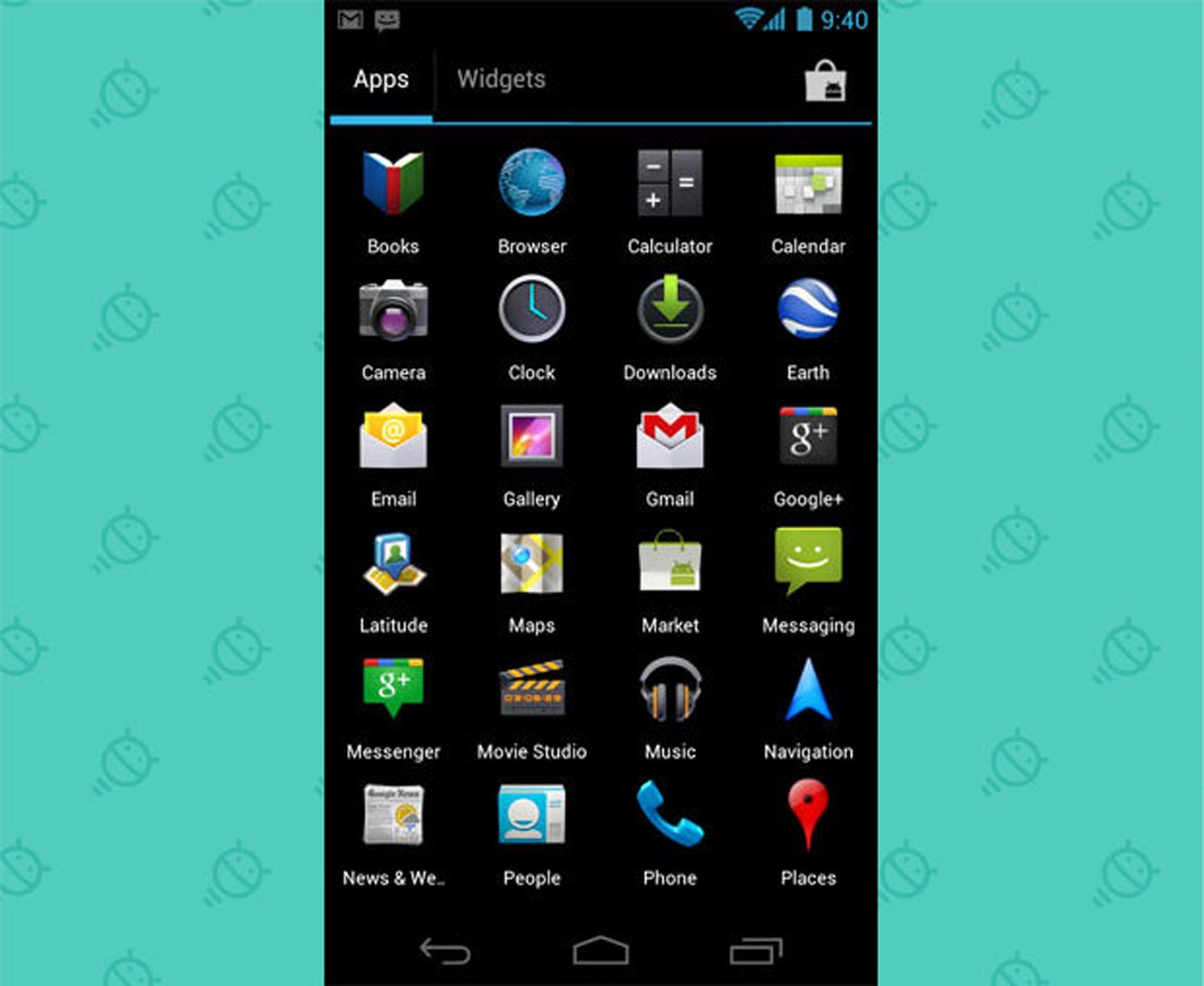
Part of that effort involved moving the option to add home screen widgets from an out-of-the-way and hidden long-press menu into the main app drawer, where it'd be plainly in sight — with widgets existing right alongside all the regular app shortcuts. The idea was to create a single streamlined place for finding everything that could be added onto your home screen. It seemed to make an awful lot of sense.
 JR
JR But, alas, it lasted for only a brief two years: Without explanation, Google yanked widgets out of the app drawer and put 'em back into their former long-press menu with 2013's Android 4.4 KitKat release. And even with the magically renewed focus on widget discovery in this year's Android 12 update, the element remains vexingly out of sight and accessible only via that long-press action.
7. Android: "Widgets belong on the lock screen!"
In other widget-related flippity-floppity, back in 2012, Google sold us on the notion that widgets would be an excellent addition to our devices' lock screens. Lock screen widgets were a key element of that year's Android 4.2 Jelly Bean release, in fact, and the pitch was impressive: Widgets were so darn useful on the home screen — so why not also make 'em available one step higher?
By Android 5.0 two years later, user-configured lock screen widgets were but a mere memory. And in this case, I don't think too many people were choked up over the change.
8. Android: "The app drawer should scroll horizontally!"
This is getting into pretty geeky waters with the history of Android versions, I realize, but Android's app drawer scrolled vertically — up and down — all the way through the platform's 2010 Gingerbread era. Then, in 2011, Honeycomb and Ice Cream Sandwich introduced a horizontal scrolling drawer, where you'd access additional pages by swiping side to side instead (a pattern we still see used by certain third-party device-makers today). It was an easier, more sensible way to access your apps! Or so we were told.
Things stayed sideways up through 2015, when an update related to that year's Android 6.0 Marshmallow release arrived without warning and moved Android's core interface back to its original up-and-down scrolling setup.
Déjà vu much, Monsieur Marshmallow?
9. Chrome OS: "The launcher should be ginormous!"
In the early days of Google's Chrome OS platform, the launcher — the Chromebook's version of an app drawer — was a small window that appeared on top of your desktop. The interface wasn't far removed from what you see with the Windows Start menu model.
At some point, though, Google rethought that approach and transformed the Chrome OS launcher into a giant, full-screen sort of affair — more like what you see on MacOS. That's still how the software behaves today.
Erm, for now, at least. Signs in the open-source Chrome OS code suggest Google's experimenting with a revamped launcher design that'd go back to the original, smaller pop-up-window setup. It'd supposedly "improve app workflows by optimizing access to apps, app content, and app actions."
Ooookay.
10. Google TV: "It's Android TV, gersh dern it!"
Maybe the funniest Google flip-flop of all time is the company's stance on its streaming media platform, Android TV.
Android TV, y'see, actually started off as Google TV when it first launched back in 2010. Four years later, Google announced it was changing the name to Android TV. And then, last October, the company launched a new Chromecast device that featured a new software layer called — wait for it — Google TV.
Technically, Google TV is a custom interface that exists atop the Android TV software. But eventually, Google says Google TV will be integrated into Android TV and the entire platform will become Google TV instead of Android TV (except maybe in certain exceptions where device-makers decide to stick with Android TV without the Google TV elements).
In related news, Google's marketing department is apparently now headed up by the ghosts of Laurel and Hardy.
11. Wear: "Smartwatches are all about notifications and proactive info!"
At its start in 2014, Google's wearable technology platform revolved around the idea of simple interactions and easy access to pertinent information. As an extraordinarily dashing Android-focused writer put it once:
It was what Wear didn't try to be that made it especially interesting. Unlike other wearable-tech efforts, the platform didn't try to cram lots of tiny buttons and complex commands into an awkward-to-use wrist-based screen. It reframed the smartwatch to be less about performing grand tasks and more about transmitting pertinent info quickly and without fuss.
But then, well, something happened: The early Wear devices weren't selling like hotcakes — and Apple's well-marketed alternative, on the other side of the mobile universe, was striking a chord with tech-hungry shoppers. So Google decided to take a little time-out and reassess its smartwatch strategy.
Self-quoting genie, hook me up again:
The Apple Watch came along, complete with its overly complicated interface and app-centric nature (something Apple would refine somewhat over time but that was almost laughably bad in the beginning). And Google, rather than sticking to the parts of its platform that made sense, decided to revamp Wear entirely and parrot Apple's flawed approach.
With 2017's Wear 2.0 update, Android Wear lost the core element that made it sensible as a wearable operating system — the focus on easily glanceable info from both notifications and predictive intelligence — and instead put the focus on things that sound impressive in ads but don't make for a great real-world experience on a tiny wrist-based screen: complicated standalone apps, cramped on-screen keyboards, and notifications that don't appear in a glanceable way and require multiple taps and interactions to process.
Yuuuuuuuup.
And we all know how this story ends. Just like clockwork, a year and a half after that ill-advised revamp, Google pulled another 180 and went back to its original vision for the platform — with the focus firmly on glanceable info and proactive assistance once more. So far, signs suggest this year's coming Wear re-re-re-revamp will more or less follow that same pattern, albeit with even more focus on trying to make products people will actually want to buy.
12. Android: "Android tablets deserve their own specialized interface!"
In 2011, Google held a splashy event at its headquarters to introduce a new era for Android. It revolved around the release of Android 3.0 Honeycomb and a newfound focus on optimizing the platform for tablet use.
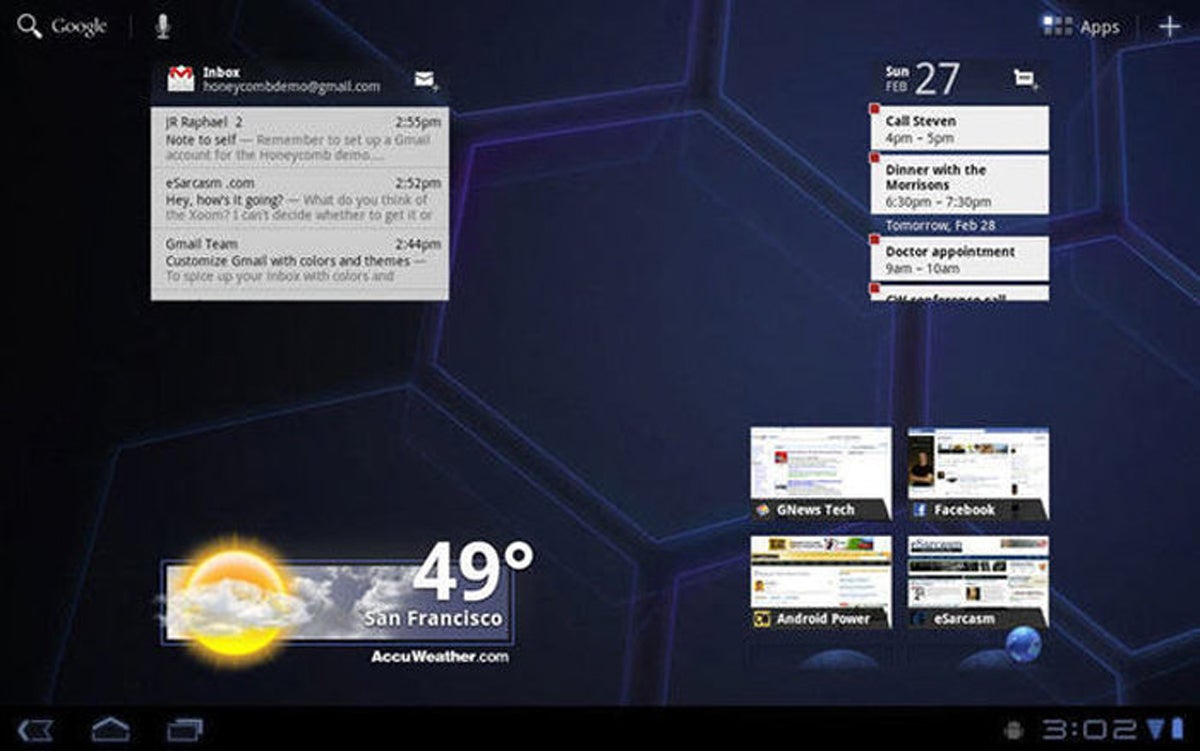
Honeycomb established a totally reimagined interface for Android on tablets, with key functions like navigation buttons, notifications, and the app drawer living in corners of the screen in order to provide easy two-handed access. It was a dramatic departure from the standard Android interface and was designed to let the operating system take full advantage of the larger screen space.
 JR
JR The tablet-specific UI was unceremoniously dumped before long, however, when Google's Android 4.2 Jelly Bean update brought a more traditional phone-like setup back to tablet screens — with "consistency and usability" being cited as the driving reasons for the reversal.
At that point, Android's notification panel remained split into two separate parts on tablets — a configuration that would stick around until 2014's Android 5.0 Lollipop release, when the tablet-based panel finished its transformation and became a single pulldown like its phone-based counterpart.
13. Android: "Face unlock is the new standard in smartphone security!"
Ah, 2011. Remember that year in Googley gadgets? All the cool kids unlocked their phones with their faces for about five minutes back then, when Google first introduced the Face Unlock feature as part of that year's Android 4.0 release. But even as the facial security system grew ever-so-slowly more reliable over the years, it was never as fast or as easy to use as a good old-fashioned pattern swipe or fingerprint tap — and it didn't take long for most folks to give up on the notion of it being anything more than an impractical-in-the-real-world parlor trick.
With the launch of 2019's Pixel 4 phone, Google gave facial recognition a fresh start. It introduced official system-level support for advanced hardware that'd make face-driven phone unlocking more consistent, secure, and effective, and it played up the Pixel 4's facial recognition feature as a meaningful advancement and advantage.
That focus on face unlocking lasted all the way to the following year's Pixel 5 flagship, which ditched facial recognition entirely without so much as a puff of explanation.
Naturally, it now looks like the feature could possibly make a comeback in this year's Pixel 6 phone. Hey, Google: You're makin' me dizzy.
14. Android: "Android needs its own native video editor!"
The high-profile launch of a new native video editing app for Android was a really big deal in 2011 — especially since there weren't many great third-party options for that function at the time (and also since, y'know, That Other Mobile Platform™ had gotten its own high-profile native editing client just one year earlier).
But Google's Movie Studio app was abandoned more or less immediately after its birth. The app never got much in the way of updates or improvements, and after shipping sporadically with Android devices through 2012's Nexus 4 phone, it just kinda silently evaporated — never to be replaced or discussed again.
This past February, a full decade later, Google finally introduced a decent video editing function as part of its Android Google Photos app. It's not the standalone video editor Android once had, but hey, it's somethin'.
15. Android: "This operating system is all about people, mmkay?"
In 2011's Android 4.0 Ice Cream Sandwich version, Google curiously renamed the platform's default Contacts app to People.
The idea behind the shift was logical enough: Our phones were about so much more than contacts, the thinking went, and so it made more sense to call the app People — and to have it act as a hub for all of our social communications.
To that end, the People app aimed to bring all of your contacts' social networking connections into single, centralized profiles. You could see a person's tweets or, yes, even Google+ postings right then and there — a "live window into your social world," as Google put it at the time.
Unfortunately, renaming Contacts to People mostly seemed to confuse people who couldn't figure out where their contacts had gone. By the Lollipop update a few years later, the app unceremoniously went back to its original name, and it didn't take long for the whole "single hub" thing to fade away, too — at least, up until last year's Android 11 release, when people suddenly became a key focal point for the operating system once again.
Oof. My head hurts.
So what gives?
Looking back through all these U-turns, it's hard not to wonder what's going on — why Google so frequently goes back and forth in an almost random-seeming manner with relatively significant decisions about how its platforms and services work.
The answer, best I can figure, is actually quite simple. Ready? Google is Google. Within Android and without — for better and for worse — the company has always shown a willingness to try things and then change course a short time later if it decides it doesn't like the new direction.
Hiroshi Lockheimer, Google's senior VP in charge of Android (and most everything else now, too, it seems), acknowledged the trend during a chat I had with him a handful of years ago.
"From a product development perspective, I think it's a great thing to be able to experiment and try new things and see what works [and] what doesn't," he said. He went on to note that too much back and forth can definitely have its downsides — namely on users who just want things to work consistently and without superfluous change.
"We're trying to find the right balance of how to iterate but also provide stability so that we're not causing whiplash," he told me.
It's an admirable goal. And who knows? Maybe to some extent, experimentation is better than stagnation — even if it does come with the occasional flipping and flopping.
Then again, maybe it isn't.
Oh, hell. I can't decide.
Want even more Googley knowledge? Sign up for my weekly newsletter to get next-level tips and insight delivered directly to your inbox.


