It's easy to overlook, but Google's ChromeOS platform is in a near-constant state of evolution. The software inside Chromebooks gets updates and improvements multiple times a month — more than any other operating system out there — and if you aren't watching closely, you might just miss something significant.
That, my Chrome-carrying companion, is absolutely the case right now.
As we speak, Google's in the midst of massaging a near-finished feature that completely changes how notifications are presented on the platform. It's a subtle-seeming shift on the surface, but once you get it up and running on your Chromebook, you'll wonder how you ever managed without it — 'cause it really will shake up the way you work and bring a welcome boost to your big-screen productivity.
For most mere mortals, the feature won't roll out for a while longer yet. But you, as an exceptionally comely and intelligent creature who reads this column, aren't most people.
And with about 20 seconds of effort, you can bring the improvement onto your favorite Chromebook this very minute — and bring yourself a smarter, more efficient, and more productive virtual workspace.
[Get Googley tips in your inbox every Friday with my Android Intelligence newsletter. Three new things to try every Friday and three bonus tips as soon as you sign up!]
Ready for your upgrade?
The ChromeOS notification separation
Real quick, let's take a peek at how notifications work on ChromeOS right now — 'cause we need that baseline point of comparison to appreciate how they're about to improve.
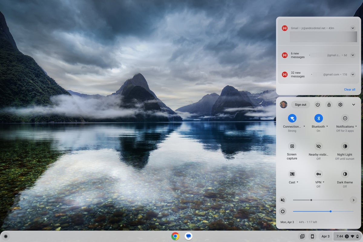
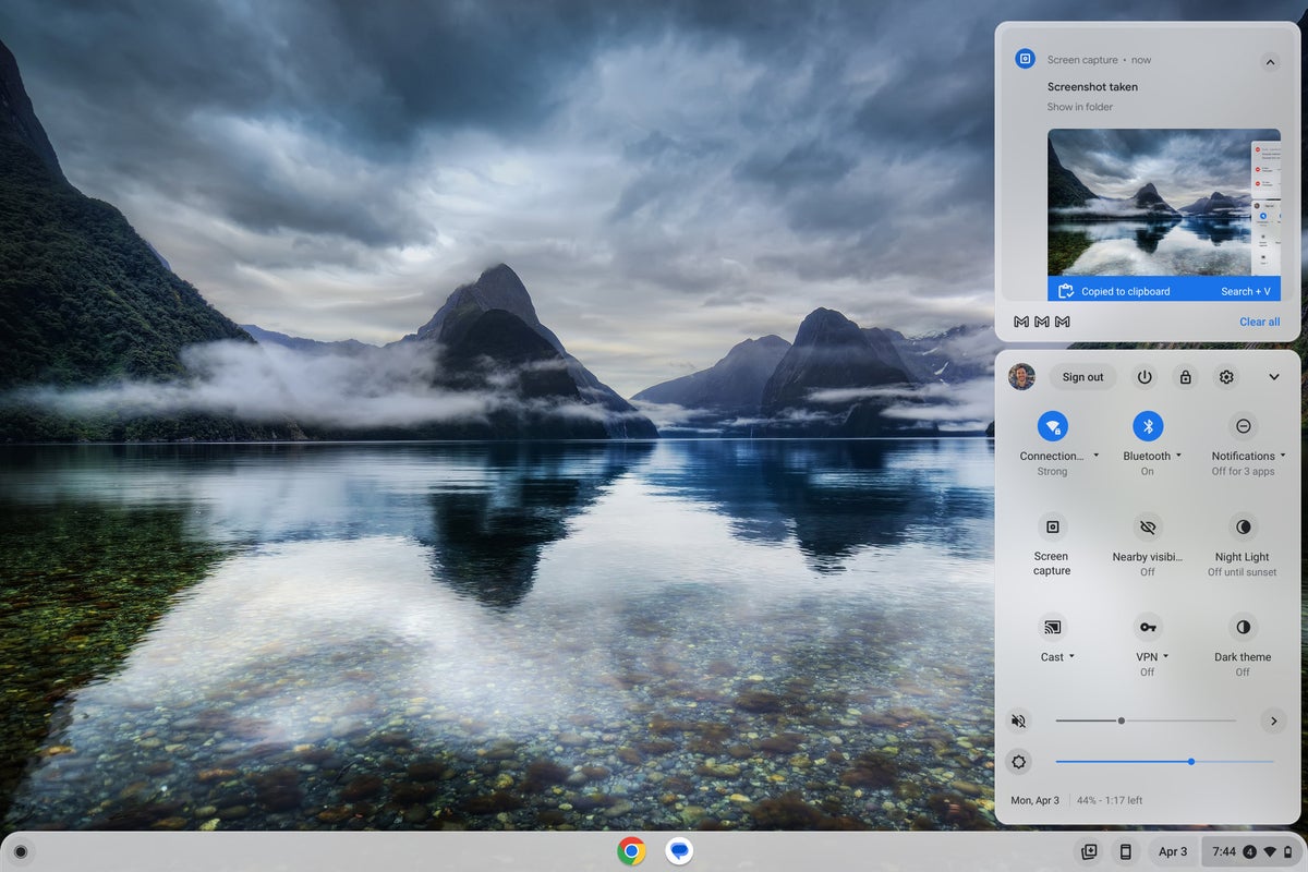
As it stands now, anytime you get a notification — be it something on the system level or something from an Android app on your Chromebook, a progressive web app, or any other type of ChromeOS-compatible app you're rockin' — it shows up atop the Android-esque Quick Settings panel in the lower-right corner of the screen.
 JR
JRAnd Goog almighty, if your days are anything like mine, it doesn't take long for that area to be absolutely overwhelmed with activity — and for that view to turn into a cluttered and unmanageable mess, where lots of potentially important alerts get buried away, hidden out of sight, and put at risk of being missed entirely.
 JR
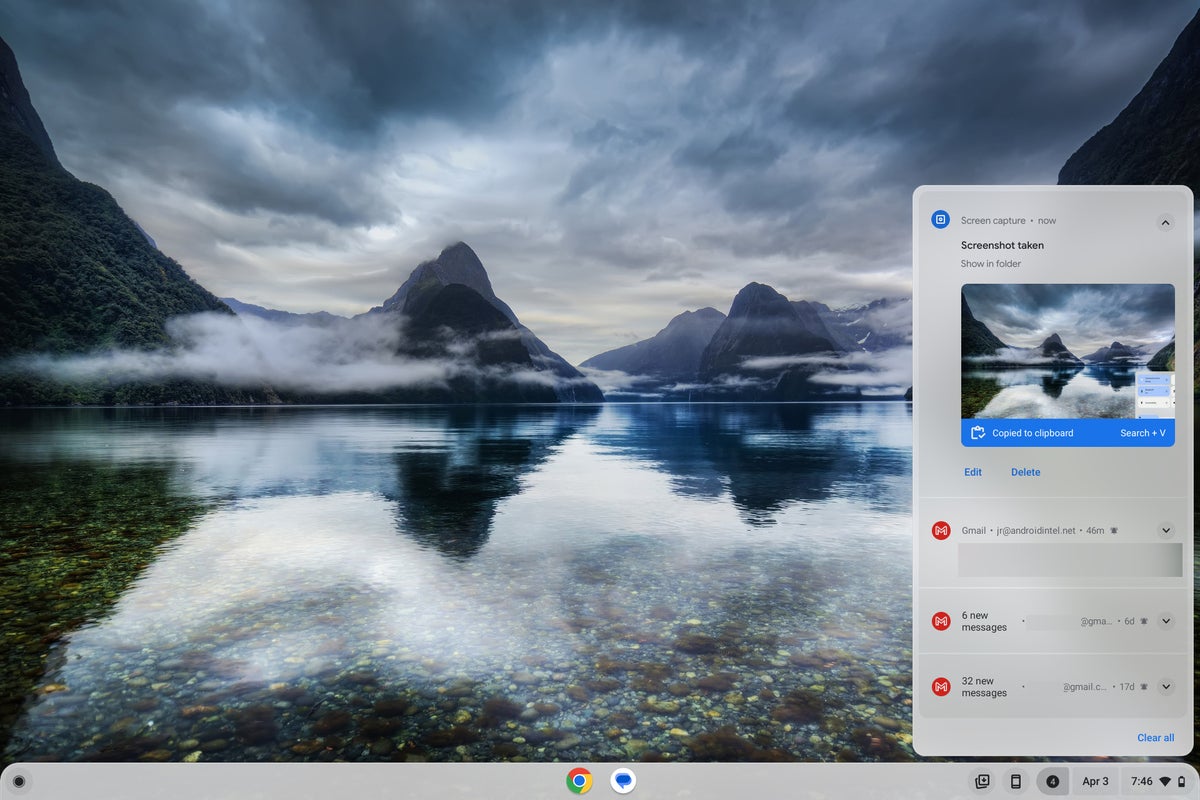
JRNow, check out what happens with the new ChromeOS improvement we're about to summon: First, notifications get shifted over into their own dedicated area next to the Quick Settings panel in the Chromebook taskbar, where they're much easier to see, sift through, and manage. It's a whole separate button that shows your current number of pending notifications at any moment (and then just goes away when no notifications are waiting).
 JR
JRAnd, as an extra bonus, the Quick Settings panel gets a refreshed look to go along with its newly narrowed purpose — with larger buttons and a design that follows the current Google Material Design standard. It'll feel instantly familiar and refreshingly consistent if you also use Android (at least Google's own standard Android setup, as seen on its self-made Pixel phones and a handful of other devices).
 JR
JRSo that's what we're doing here. Now, clear that 20-second window on your calendar and let's make it happen, shall we?
Your smarter Chromebook notification formula
This really is easy, I swear. In fact, you've got just four fast steps to bring the new ChromeOS notification improvement onto your Chromebook without any waiting:
- Open up a new Chrome window and type chrome:flags into the address bar.
- Type qs into the search box at the top of the screen that comes up.
- See the line labeled "Quick Settings Revamp"? Change the setting alongside it from "Default" to "Enabled."
- Click the blue Restart button in the lower-right corner of the screen.
That's it! Your Chromebook should restart itself, and you should be staring at your fancy new enhanced taskbar arrangement.
If for any reason you don't see the option or it doesn't work as expected, make sure you're running the latest available ChromeOS version — ChromeOS 111, as of this writing. You can do so by clicking on the clock area in the lower-right corner of your Chromebook's screen and then clicking the gear-shaped icon to open your system settings.
Click "About ChromeOS" in the lower-left corner of that menu and then look to see what version of ChromeOS is present on the device. If it's anything lower than ChromeOS version 111, click the Check for Updates button to see if a more current version is available. Then, once that update has applied, repeat the four steps above to summon your sleek new notification enhancement.
Welcome to the future, baby. And stay tuned, 'cause this is ChromeOS we're workin' with here. And that means there'll be no shortage of other shiny new improvements to stumble onto soon.
Want even more useful knowledge for your favorite Googley gadgets? Sign up for my weekly newsletter to get three new things to try every Friday and three bonus tips now.


