Google's Android 5.0 Lollipop release has lots of good things going for it -- but like many major OS releases at their start, the software also has its share of sigh-inducing quirks and glitches.
As Lollipop slowly makes its way to more devices, let's hope Google fixes these pressing issues sooner than later:
1. Memory management
I'm not the guy to pinpoint the source of the problem, but something's clearly amiss with memory management on Android 5.0. I first experienced it while reviewing the Nexus 9 and have since seen it (and read countless other users' reports of it) happening on other devices as well.
In short, Lollipop -- on some devices, at least -- seems to have trouble keeping processes running in active memory. As a result, you'll sometimes experience things like recently used apps "refreshing" and starting from scratch when you return to them, music-streaming apps like Google Play Music or Pandora randomly closing when they're running in the background, the home screen taking a moment to "redraw" itself when you return to it, and system-level actions like loading the Overview list acting less responsive than they should.
The fact that these things are now happening on multiple devices -- including both those designed for Lollipop and those that didn't have such issues prior to running Lollipop -- seems to indicate that it's a broader OS-level issue as opposed to anything limited to one particular set of hardware. And suffice it to say, that isn't a good thing.
2. Silent mode -- or lack thereof
Lollipop's new notification system is plenty powerful, but it's lacking one fundamental option: a simple way to set your phone to silent.
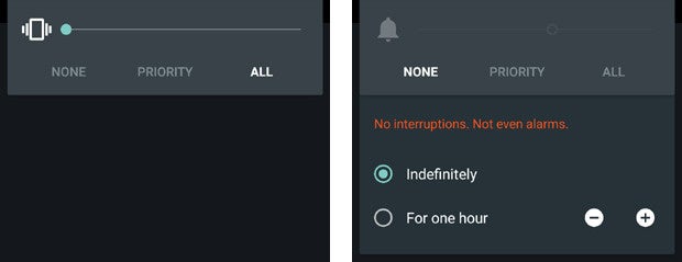
In past versions of Android, you could either just lower a device's volume all the way down or long-press the power button and use the direct shortcut there to activate silent mode. On Lollipop, lowering the volume all the way on a phone gets you to a vibrate-only state -- but there's no way to move from that to silent. And the power button shortcut is no longer present at all.
Instead, you have to first press your device's volume-up or volume-down key and then select the new "None" notifications setting -- which isn't at all intuitive and is going to confuse the hell out of most ordinary users. And on top of that, the "None" notifications setting prohibits even alarms from sounding, while a traditional silent mode does not.

The search for silent mode on Android 5.0
The only other option you have is to configure Lollipop's "Priority" notifications setting so that it'll allow alarms to sound but nothing else. That's an awful lot of work for something that should be so simple, though -- and again, it's something most ordinary users aren't going to figure out.
(On tablets, bafflingly, you can still activate a silent mode by lowering the volume all the way until the device goes into vibrate-only and then pressing volume-up once from there. Go figure.)
This may be less of a bug and more of an odd design decision -- but whatever you want to call it, it needs to be fixed.
3. Overloaded Overview
Lollipop's expanded approach to multitasking is one of those things that's great in theory but not quite there yet in reality. The basic idea is that the Overview button -- the command next to the Home button, also sometimes known as Recent Apps -- brings up a scrolling list of cards with all the processes you've used recently on your device. You can then jump directly to any of those tasks on demand, regardless of where you are in the system.
Part of that means that Overview no longer contains only apps, as it did in previous versions of Android; instead, it now splits apps apart into multiple steps, each is which is represented by a separate card. If you open Gmail and then start to compose a new message, for instance, you'll see a card in the Overview list for both Gmail itself and for the individual message.
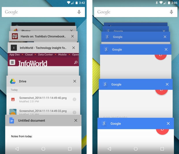
The problem is that the Overview list quickly turns into an enormous mess of overlapping items that's more overwhelming than useful. No exaggeration: The Overview list on my Lollipop-running Moto X has 80 cards in it right now. Eighty cards! When I was reviewing the Nexus 6, it had 60 cards in the Overview list at one point -- 22 of which were various instances of a Google search process. The Overview list never seems to clear itself, either, even when you turn the device off.

Dozens upon dozens of often-overlapping cards -- there has to be a better way
(As I noted in my review of the OS a couple months ago, you can swipe items away one by one to dismiss them -- but that isn't really a scalable solution, and you as the user shouldn't have to worry about playing custodian throughout the day.)
The new Overview list could be a wonderful thing. With its current implementation, though, its unmanageable nature acts as a source of frustration and severely limits its productivity potential.
4. Nonfunctional notifications
Lollipop introduces a new type of notification known as a "heads-up" notification. It's meant to provide a less distracting way for you to see pertinent information, but in reality, it often does just the opposite.
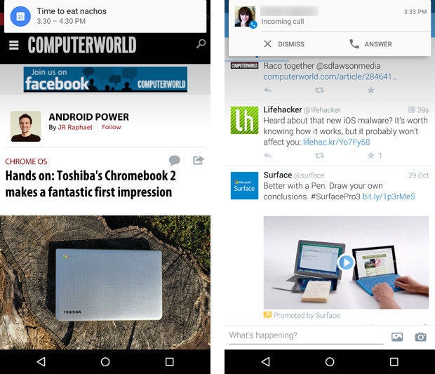
With the new "heads-up" notification system, alerts for things like incoming calls, text messages, and calendar events appear as floating cards at the top of your screen -- on top of whatever else you're viewing. You can either tap them to open them or swipe them away to dismiss them.

Lollipop's new "heads-up" notifications
The issue with this is two-fold: First, the "heads-up" card shows you only a tiny snippet of message-oriented notifications and provides no way to expand them and view their full contents without switching over to the source app (e.g. Hangouts, Gmail, or whatever is sending the alert). That's a step backwards in functionality from the old Android notification system, in which incoming messages would appear in their entirety within the top-of-screen notification panel (using a subtle scrolling mechanism when needed).
And second, if you're in the middle of doing something else on your device and don't want to deal with an incoming "heads-up" notification right away -- but do want to keep it around so you'll remember to deal with it later -- your only choice is to stop what you're doing and wait about 10 seconds until the card disappears on its own, at which point it'll move up into your notification panel as a regular alert. If you swipe the card away, the notification will get dismissed for good.
For the "heads-up" system to work, we need (a) a way to expand incoming notifications and view them in their entirety (similar to the way we can swipe down on normal notifications in the notification panel to do just that) and (b) a way to push incoming notifications upward to get them off the screen but keep them available in the notification panel. The current system just doesn't cut it and frequently feels like a worse version of what we had before.
UPDATE: A 60-second fix for Lollipop's heads-up notification nuisance
5. Lock screen oddities
Along with Lollipop's new notification system comes a revamped lock screen that shows your pending notifications and lets you deal with them right then and there.
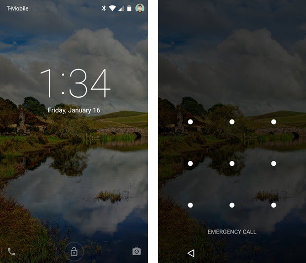
That's convenient in theory, but the current implementation has a couple of irksome quirks. For one, if you use a security pattern, password, or PIN, the new lock screen requires you to take an extra step every time you want to unlock your device: You first have to swipe away the initial screen -- where any notifications are displayed along with a large clock -- before you can input your code. Even if you disable lock screen notifications altogether, you still have to swipe away the clock before you can get to the security prompt.
Given how often most of us unlock our devices, that extra step can get annoying fast -- and there's no reason that disabling lock screen notifications shouldn't also disable that superfluous initial screen.

Even with lock screen notifications disabled, you have to swipe away an initial screen (at left) before you can input your code (at right). Why not just put the clock above the security prompt?
Beyond that, the Lollipop lock screen has a weird behavior in which swiping upward unlocks the device -- which makes sense -- but swiping downward takes you to a full-screen view of your pending notifications (essentially the same thing you were already looking at, only without the clock). The latter is quite confusing, particularly since there are no visual cues to indicate that'll happen and the behavior itself doesn't seem to serve any purpose.

Déjà vu: When you swipe downward on the main lock screen (at left), you see a full-screen view of your notifications (at right)
On my initial moments with Lollipop -- even as someone who's used Android for ages and spends hours every day dealing with mobile devices -- it took me a few minutes of trial and error to figure out what was going on with the different lock screen swiping behaviors. I saw the same thing happen to several family members and friends when they first got Lollipop on their devices, too, only accompanied by even more confusion (along with a puzzled glance pointed in my direction).
A little tweaking would go a long way in simplifying and improving that user experience.
All things in perspective
As we wrap up this list of quibbles, let's be clear about one thing: Lollipop represents a foundational shift for Android, and by and large, it's an enormous leap forward for the platform. From its gorgeous visual overhaul to its numerous new features, the software truly is the start of a whole new chapter for the operating system -- one that presents ample cause for optimism and excitement.
But it's very much a beginning -- and particularly now that we've had more time to live with Lollipop and experience it on a variety of devices, it's clear that Google still has some work left to fine-tune the software and iron out the kinks. The good news is that the issues are all perfectly solvable -- and in the grand scheme of things, they'll likely become mere bumps in the road of Android's evolution.
With any luck, that pavement will be smoothed out soon.


