Don't tell anyone I told you this, but I'm starting to think Google's got it out for me.
Let me explain: I took last week off, in case you didn't notice. (What?! You mean your world doesn't revolve around my presence? How dare!) It was a seemingly quiet week in March -- after the big trade shows and before the early spring announcement rush. A fine time for some offline family time...or so I thought.
Then, BAM! Out of nowhere, Google dropped the first developer preview of the upcoming Android "N" release -- without warning and without precedent. (These things usually happen at the Google I/O developers' convention, which is what most of us were expecting this go-round.) Now, I don't take that much vacation time. So seriously: What are the odds of that happening this one random week when I was tuned out in March?!
Coincidence? Probably -- though I do seem to have a knack for this sort of thing. But enough about me: The point of all this rambling is that I'm getting to know the Android "N" developer preview right now -- and you know what? It's got some pretty interesting elements beyond the obvious big items.
By now, you've probably heard plenty about the marquee features like native support for a multi-window mode and a fine-tuned (though, sorry, still snooze-free) take on notifications. Those are promising changes that should enhance the device-using experience for a lot of people. For me, though, it's been two smaller tweaks to the software that have made the most meaningful impact in day-to-day use.
Let's get into 'em:
Android 'N' highlight #1: Fast app switching
One of my long-standing beefs with Android from a productivity standpoint has been the lack of a snappy way to switch between apps. It's most apparent when you're using a laptop-emulating device like the Pixel C, but once you pick up on it, it's hard not to notice on any regular phone or tablet, too.
The current preview of Android "N" fixes that by introducing a super-speedy "Alt-Tab"-like option: You simply double-tap the Overview key (the square system icon right next to Home), and -- shazam! -- you're taken instantly to the last app you had open. You can do the double-tap from within another app or from your home screen, and it works the same way:
(The actual process is snappier than what this video shows. Screen recording just gets a little jerky sometimes.)
You can still single-tap the Overview key to view a card-based list of your recently used apps as well -- and from that screen, you can now keep single-tapping the Overview key to cycle quickly through the cards and find what you want:
I'm not entirely sold on the implementation, as it adds a new factor of complexity into the operating system -- a hidden command that most typical users won't be aware of, which is the kind of thing Android had been moving away from for a while. But the function itself is fantastic and makes the act of hopping between apps far more instant and desktop-like on any device.
As far as I'm concerned, that's worth a lot.
Android 'N' highlight #2: Share menu pinning
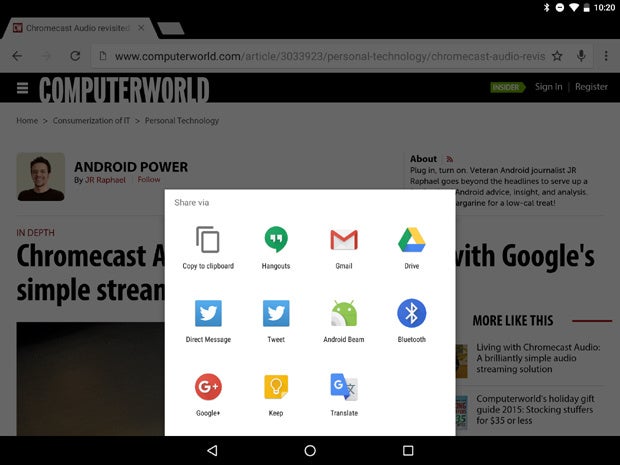
Google has gone through a bunch of different methods of organizing Android's Share menu over the years. Best I can tell, most of them boil down to "a seemingly random order I can never quite figure out, where the apps I need are never in the right place."
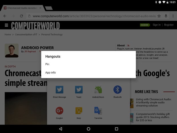
The first Android "N" preview offers an answer: the ability to manually pin your most used apps in the Share menu so they always appear at the top. From the Share menu, you just long-press the icon you want to pin, and a new dialog box appears:

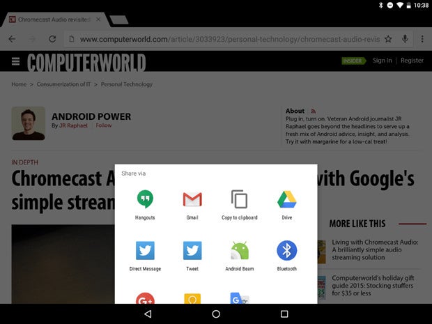
Once you select "Pin," that app moves to the first position in the Share menu and stays in that spot with every subsequent share from anywhere in the system:

You can pin multiple apps, too, and they'll appear at the top of the list in the order they were pinned. (Your call is important to us! Please stay on the line...)

A simple improvement, to be sure -- but one that'll make my life easier numerous times a day. Again, I'm a teensy bit wary of the hidden nature of the implementation, as it's not the most obvious or user-friendly sort of UI, but this isn't the time to nitpick.
Remember: This is only a developer preview -- and the first public build of it, at that. It isn't consumer software, and it isn't the same thing that'll make its way to phones and tablets later this year.
An early preview is by its very nature unfinished and rough around the edges -- and, as we've seen with past years' previews, some of the features may end up working differently by the time they're done (or may even end up being eliminated altogether). Other elements that aren't present now could show up as surprises by the time the final release rolls around.
But for all the asterisks, this software gives us a good general idea of the things Google's working on and the sorts of concepts likely on the horizon. And with that context in mind, I'm optimistic about what Android "N" will deliver -- and excited to see how it's about to evolve.


