I don't know if you've noticed, but I've been thinking an awful lot about Android keyboards this week. I'd even go as far as to say they've been dominating my brainwaves for the past several days. (Yes, I really am that cool. Try to contain your admiration.)
And you know what? Devoting all this mental energy to the simple-seeming subject of tapping out text on a phone has made me realize something: We — both the collective "we" representing us, the exceptionally smart and attractive earthlings who use and enjoy Android-based cellular telephones, and the broader "we" representing mobile-tech observers in general — have come to take for granted just how incredible the Android keyboard experience truly is.
As I mused in Tuesday's column, most of us rarely to never actively think about the keyboard-powering app on our mobile devices — and in many ways, that's actually a good thing. Just like with effective interface design, when something works well, you shouldn't think about it. That's how you know it's working.
But today, I want to break that rule for a minute — because we've certainly devoted plenty of brainpower as of late to thinking through the ways Google is missing the mark when it comes to Android design and development. So for once, I'd like to take a few minutes to talk about an area where El Googley-oo is absolutely getting it right — especially since it's an area that tends to be underappreciated on all sides of the mobile-tech spectrum.
The reality, as I've noted before, is that the app powering the keyboard on your phone is arguably the most important piece of software you use. No matter how amazing your email app or office suite or note-taking doojigger may be, an unexceptional keyboard will hold you back and keep you from getting as much as you could out of those utilities. When it comes to productivity and efficiency, the system that allows you to input text on your phone is front and center and critical to the effectiveness of practically every part of your phone-using experience.
And if you want to be reminded of just how effective our current Android keyboard options are, all you've gotta do is pick up an iPhone and try to type on it for a couple minutes. It's almost shocking to spend some time actually using Apple's oft-praised, magical and revolutionary iOS keyboard after being accustomed to the unsung Android typing arrangement. Quite honestly, it feels like stepping back in time to an earlier, less advanced era of smartphone typing technology.
Now, don't get me wrong: The iOS keyboard is certainly fine, especially if it's the only typing experience you know. I mean, it gets the job done, and plenty of people use it — the vast, overwhelming majority of iPhone-totin' humans and/or walruses, if I had to wager a guess. But everything about it is noticeably less powerful, efficient, and thoughtfully presented than what we see and take for granted on the Android side — almost comically so. And once you have that perspective, the difference is impossible to ignore.
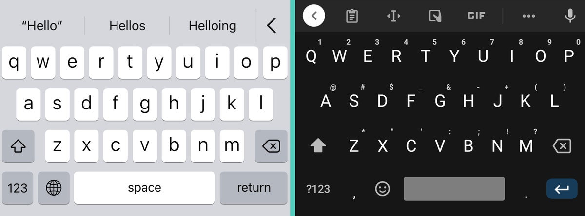
Simple things like being able to see numbers, punctuation, and special characters for effortless access in the primary keyboard view are strangely absent. More advanced possibilities like being able to float your keyboard around on a larger screen, being able to access your clipboard for quick pasting of recent or pinned items, and being able to trigger real-time translation as you type are similarly missing in action. Even the silly-seeming but sometimes useful task of being able to search for and insert GIFs from within the keyboard isn't usually possible in that environment.
 JR
JR
Apple's current iOS keyboard alongside Android's Gboard keyboard. Wait, what year is this, again?
To Apple's credit, its default iOS keyboard experience has come a long way over the past several years. The company added the long-missing ability to type by swiping just under a year and a half ago, and it started supporting third-party keyboard apps in 2014 — though those apps have generally been seen as second-class citizens, without full system support and with a range of reported issues revolving around consistency and reliability. Even if you do get Gboard up and running on an iPhone, the typing experience on it is nowhere near as advanced or complete as what you get with the full Gboard setup on Android, presumably due to the differing framework in Apple's universe.
I point all of this out less for the mere sport of Apple-bashing (entertaining as that pastime can be) and more to remind ourselves how outstanding the typing experience is on Android — not only with Gboard, either, but with any of the more noteworthy Android keyboard options. The positives are in part because of the default keyboard Google created but also because of the foundation Google built within Android and the way it grants you the power to find any keyboard you like and have it act as a fully featured first-class citizen.
For all the time we spend picking nits and thinking through things Google could be doing better, it's important to remember the critical, experience-defining areas where Android absolutely gets it right. And lemme tell ya, after spending weeks getting intimately familiar with practically every smartphone typing scenario imaginable, I can say with zero uncertainty that we've got it pretty darn good — so good, in fact, that we don't typically have to stop and think about it. We can just go about our days and know, even if only subconsciously, that we're maxing out on efficiency and having a hassle-free, truly exceptional mobile text input experience.
Sign up for my weekly newsletter to get more practical tips, personal recommendations, and plain-English perspective on the news that matters.

[Android Intelligence videos at Computerworld]


