Android 4.2 lock screen widgets: Hands-on impressions and gallery

With Google's Nexus 4 and Nexus 10 now officially on sale, the last few features of Android 4.2 are finally falling into place.
In my early coverage of Google's new devices and updated platform, two features in particular were M.I.A.: multiuser support and lock screen widgets. Today, we're getting a detailed look at both.
I took you on a tour of Android 4.2 multiuser support a bit earlier. Let's turn our attention now to the new lock screen widgets and exactly how they work.
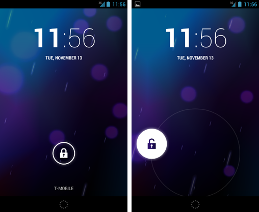
Android 4.2's lock screen widgets are actually less of a feature and more of a revamp of the lock screen as we know it. The new 4.2-level lock screen takes on a whole new look -- and a whole new method of interaction, too.
One of the first things you'll notice is that while the old slide-unlock let you slide to the left to jump to your camera and slide up to jump to Google Now, the new 4.2 slide-unlock simply unlocks the device -- no matter which way you move it.

A circular icon at the bottom of the screen gives you quick access to Google Now, while swiping your finger to the left anywhere on the lock screen takes you directly to the Camera app.

The same Camera shortcut exists even if you have a pattern or PIN in place, which seems a bit odd to me. The system will prompt for your passcode before letting you get into the Gallery, but still: Anyone could get to the Camera app itself and snap photos without having to unlock the phone. I wouldn't flag that as a major security threat or anything, but it's certainly, well, odd. And it could open the door to some unfortunate photo-taking pranks.
When you have a pattern or PIN set, the system does prompt you to unlock prior to granting access to Google Now. That's reassuring, at least.
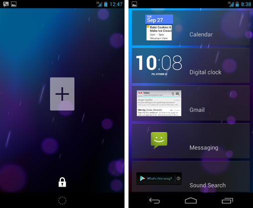
So, onto the customizable widgets: With Android 4.2, you now have multiple panels on your lock screen, much like what you have on the home screen. When you swipe your finger to the right on the main lock screen panel, the screen slides over to reveal a new panel with a large gray plus sign. Tapping the plus sign shows you a list of available widgets you can add.

At this point, only five widgets are available: Calendar, Digital Clock, Gmail, Messaging, and Sound Search. Google says third-party developers will be able to make lock screen widgets, too, though, so it likely won't be long until we see more options showing up.
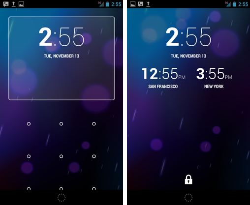
[UPDATE: Get a world clock on your Android 4.2 lock screen]
You can tap any widget to add it onto your new panel. You can then long-press any widget to move it from one panel to another. You can even replace the default clock on your main lock screen panel with something else, if you want.
(If you have a security PIN or pattern set, the system does make you unlock the phone before adding widgets. It does not prompt for a passcode, however, before allowing you to move and rearrange widgets -- another piece of this system that strikes me as rather odd.)

Speaking of security, you can scroll through any widget -- like the Gmail or Messaging widgets -- without having to unlock the device. In order to open a message or do anything more, you do have to unlock the phone and enter your PIN or password if you have one.
Still, it's worth noting that if you add widgets like Gmail or Messaging, anyone can look through your inbox -- the subjects and first few words of messages -- even if your phone is locked. That's something to seriously consider before putting any such widgets in place.

The system lets you place just one widget on each lock screen panel. It appears you can add up to four lock screen panels; when you factor in the main default panel, that gives you space for as many as five lock screen widgets.
On any given panel, you can tap a lock icon at the bottom of the screen to shrink the widget down and access the unlocking mechanism (i.e. the slide, pattern, or PIN). Similarly, on the main default panel, you can press and hold the widget above the locking mechanism to slide it down and expand it to a full-screen state.

With Android 4.1, certain widgets -- like those for the stock Play Music app and other audio programs -- would automatically appear on your lock screen when they were relevant. This is still the case with the new Android 4.2 lock screen setup: When you're listening to music, for example, the Play Music widget shows up on the main lock screen panel and everything else slides over one spot to the left. Like with other lock screen widgets, you can tap and drag that widget to hide the locking mechanism and expand it into a full-screen state.

On tablets, the same basic concept applies but things look a little different, given the extra on-screen space.

So there you have it: lock screen widgets on Android 4.2. It's not a perfect system, and there are certainly some areas where it could be improved. In particular, I'd like to see options for restricting access to the Camera app and the widget rearrange function. Implementing a security warning for users who opt to add email or messaging widgets also seems like it might be wise.

Those issues aside, though, the new lock screen widgets add a powerful new layer of unique functionality into Android. With a little more polish -- and the inevitable support that'll arrive from third-party developers -- they'll be a welcome asset to an ever-improving platform.
SEE ALSO:
• Android 4.2 multiuser support: Hands-on impressions and gallery
• Android 4.2: The poise and the polish
• Android 4.2, Jelly Bean: The complete FAQ
Copyright © 2012 IDG Communications, Inc.


